Rantiy, Mobile app with .NET MAUI - Part 1
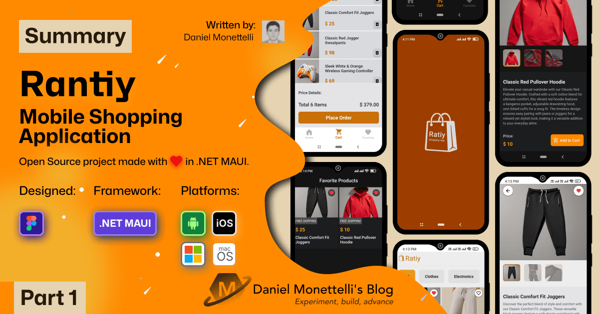
In this post, I will briefly summarize some of the features of Rantiy, how certain design tools made it possible to reduce development time, and also show you some techniques I use to improve the UI.
Why the Name Rantiy
The word “Rantiy” is of Quechua origin and means “buy”. That’s exactly the function of the app: to buy different types of products, just like an e-commerce platform.
API Used in Rantiy
The Rantiy app uses the Platzi Fake Store API, which I discovered thanks to a post from Midudev, mentioning that the site https://publicapis.dev/ offers a variety of free APIs. From there, I was inspired to create this humble shopping app built with .NET MAUI. Some details still need polishing, but at this stage, I believe it’s enough to provide you with a small but useful summary of it.
Figma, My Undisputed Ally for Design and Prototyping
When it comes to creating beautiful designs, Figma is first in my mind. Now, with the new updates added to Figma, it has won me over entirely, as I’ve created beautiful UIs for .NET MAUI with it. I believe learning Figma has broadened my perspective and allowed me to find that crystal bridge between designers and developers. It has also helped me understand how to create UIs that adapt to everything that .NET MAUI currently offers, thus improving the process of developing a beautiful application in a short time.
 Design and prototype creation using figma
Zeplin, the Time Saver in Development
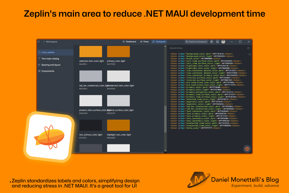
When I think of a tool that facilitates collaboration between designers and programmers, Zeplin stands out as my favorite. It meets all the requirements to enhance my productivity as a developer. I just need to spend some time defining color nomenclature and labels. Additionally, thanks to a special plugin for Xamarin.Forms and .NET MAUI, I can easily copy my text styles and colors directly into my .NET MAUI project.
 Zeplin main area to cut dotnetmaui time
Adaptability on the Splash Screen
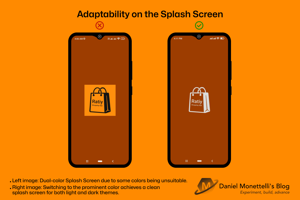
One of my first challenges was finding a way for the splash screen to have a color similar to or identical to my design. It turns out that the splash screen looks good in light mode, but in dark mode, it appears with a double color that’s not very aesthetic. After trial and error, I concluded that the color accepted by .NET MAUI is the one that predominates. And voilà, here are the results!
 Adaptability on the Splash Screen
Maui Community Toolkit at Your Service
This library keeps adding new components, and one that stands out is the color change for the navigation bar and the status bar, a feature awaited by many developers. As seen in the image, it makes the Rantiy app look much more beautiful and gives it a cohesive aesthetic throughout the UI, both in light and dark themes. Look at this beautiful page!
 Color management for navigationbar and statusbar with maui toolkit
Grid for Everything?
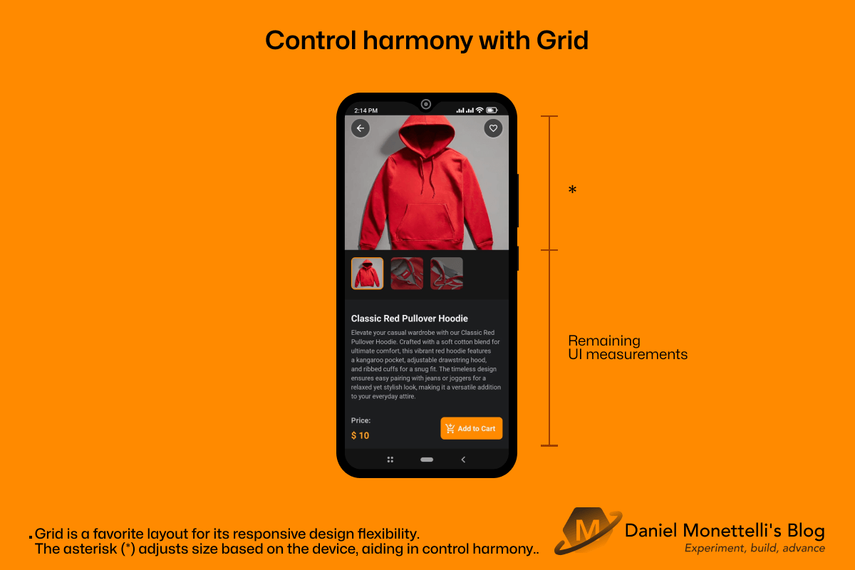
Grid is undoubtedly a layout used by many developers, but its debate over whether to use it for everything is a topic of discussion. Personally, sometimes I don’t hesitate to use Grid to nest multiple controls. In that sense, I believe we all agree that it’s better to use it in those cases. However, in situations where only two controls need to be nested, one questions: Should I use it in that scenario? For me, the answer depends on the context, and I will explain this further in the upcoming posts about my Rantiy app. Here’s a small example of using Grid.
Conclusions
Learning new design tools will help us understand what it’s like to be in the shoes of those creating a design. It will also allow us to expand our approach to a design that adapts to the evolving technology. Having a collaboration tool is a great communication bridge between the designer and the developer. Having these UI design skills is a great plus for developing quality applications focused on UX, which is what matters most and for which they are created.
Feel free to give me your opinion and, with the help of my repository, draw your own conclusions. If you have any constructive questions or suggestions, I would very much like to read them. Thanks for your time.

