Xamarin.Forms UI/UX Challenges - Micuna Food - Part1

This first part of the challenge the protagonist is Visual State Manager, the easy use of changing one state to another through XAML and C# code-behind and combining with styles, makes it a powerful Xamarin.Forms feature.
This publication is part of the Second Xamarin Advent Calendar in Spanish organized by Dr. Luis Beltrán, and of the third C# Advent Calendar in Spanish organized by Ing. Benjamín Camacho, thank you very much for being part of these great initiatives.
Inspirational Design
Ghulam Rasool’s Delicious Food design is a cool light theme from Material Design, it has icons and labels at the top, a category section, with two horizontal lists, accompanied by a stylish TabView that highlights the design.
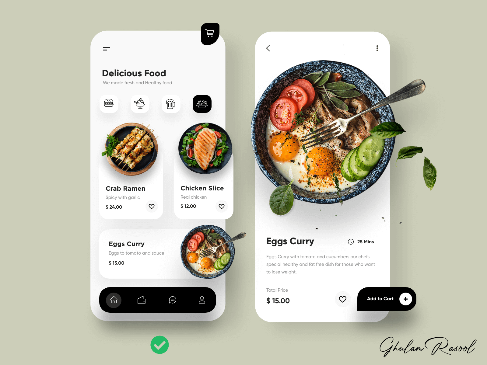 Design created by Ghulam Rasool (Experienced Product Designer)
Proportions in the Interface
In my other posts I always say that Grid is my ally when I create Harmonic Applications in Xamarin.Forms, since each control and layout has its own location thanks to the proportions, the following figures are a clear example of this.
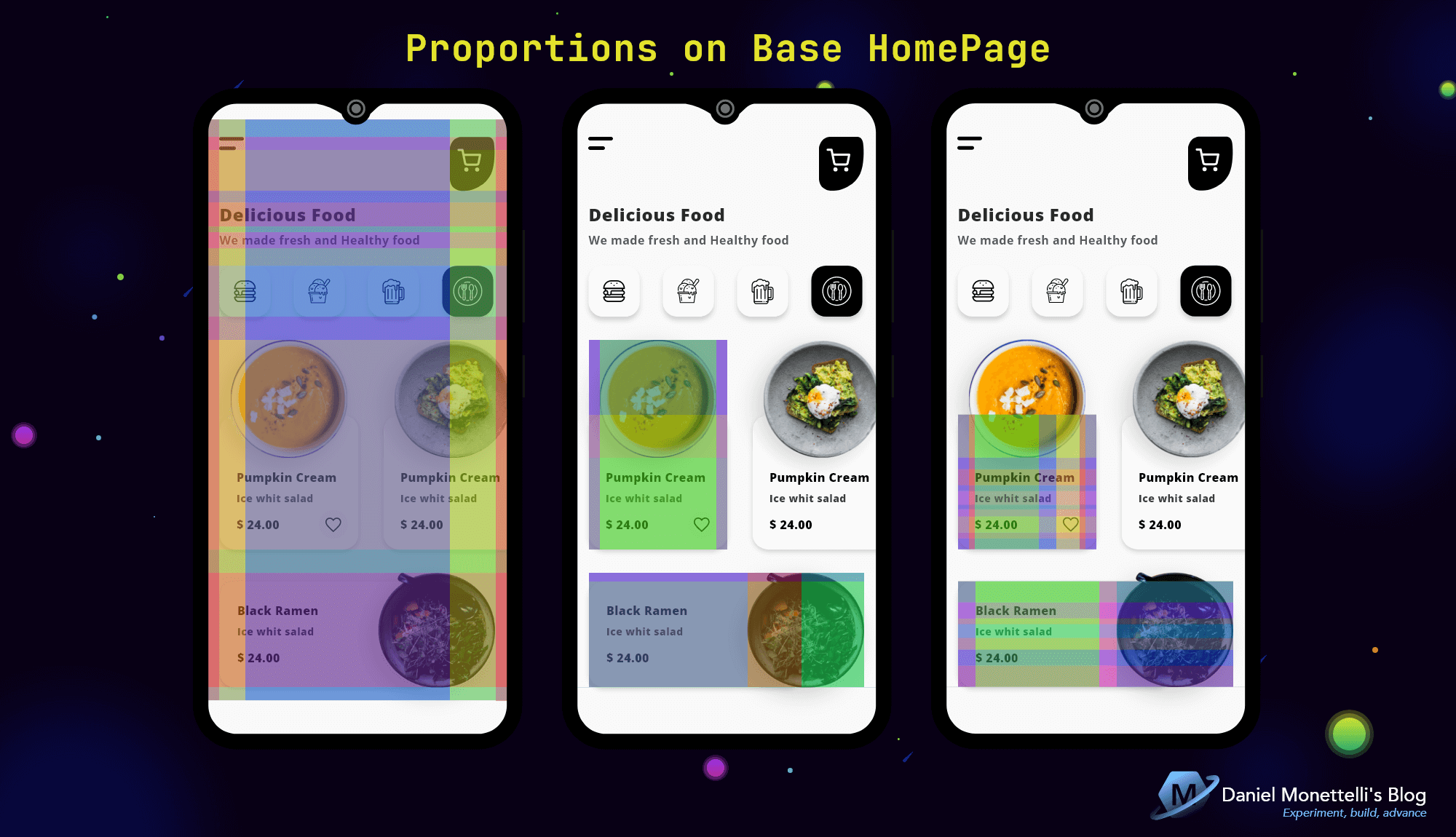 Proportions on Base HomePage
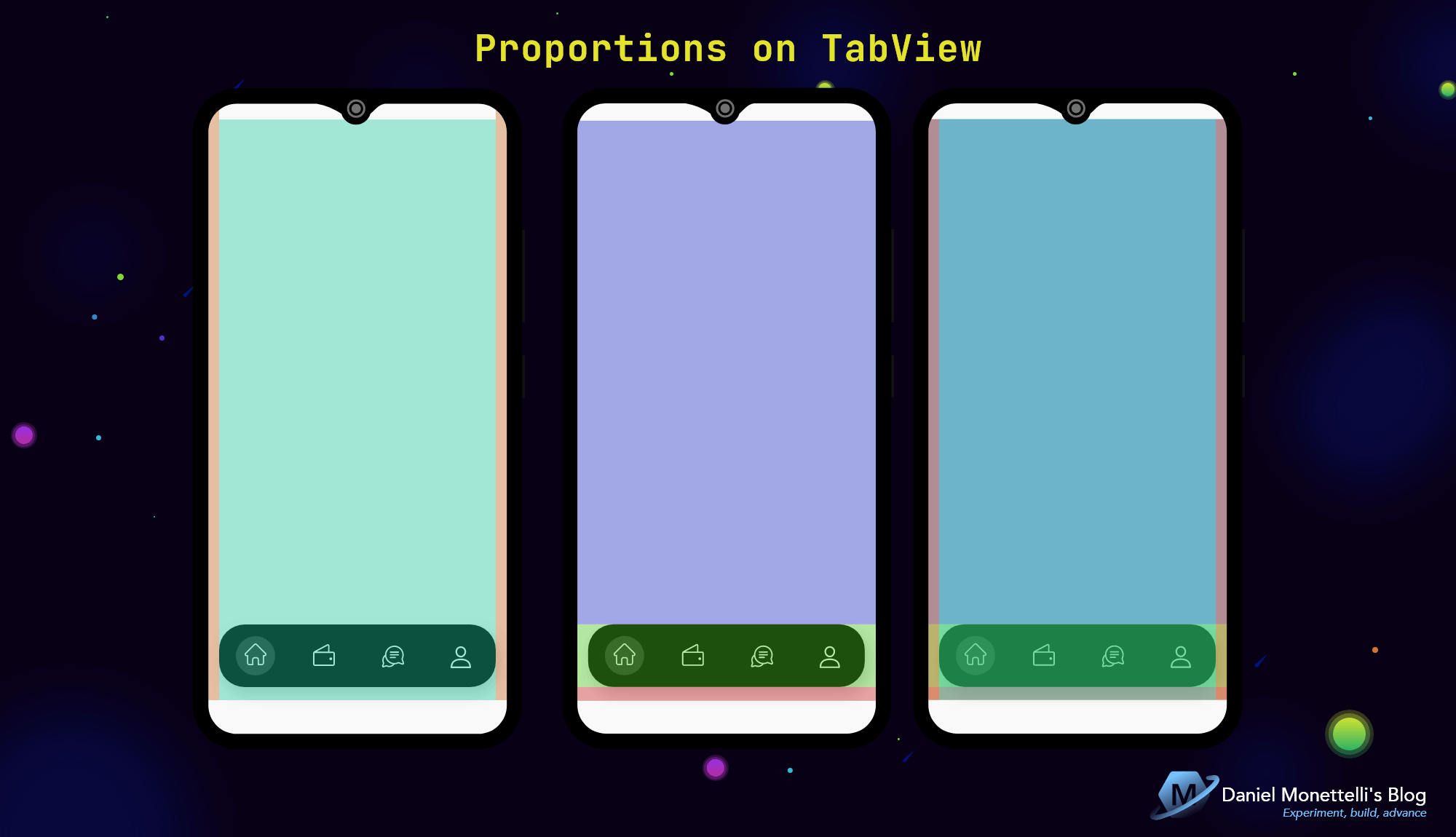 Proportions on TabView
Proportions in HomePage.xaml
1
2
3
4
5
6
7
8
9
10
11
12
13
14
15
16
17
18
19
20
21
22
23
24
25
26
27
28
29
30
31
32
33
34
35
36
37
38
39
40
41
42
43
44
45
46
47
48
49
50
51
52
53
54
55
56
57
58
59
60
61
62
63
64
65
66
67
68
69
70
71
72
73
74
75
76
77
78
79
80
81
82
<Grid>

    <Grid.RowDefinitions>
        <!--  0  -->
        <RowDefinition Height="0.869*" />
        <!--  1  -->
        <RowDefinition Height="Auto" />
        <!--  2  -->
        <RowDefinition Height="18" />
    </Grid.RowDefinitions>

    <Grid.ColumnDefinitions>
        <!--  0  -->
        <ColumnDefinition Width="0.04*" />
        <!--  1  -->
        <ColumnDefinition Width="0.92*" />
        <!--  2  -->
        <ColumnDefinition Width="0.04*" />
    </Grid.ColumnDefinitions>

    <ScrollView
        Grid.RowSpan="3"
        Grid.ColumnSpan="3">
        <Grid>
            <Grid.RowDefinitions>
                <!--  0  -->
                <RowDefinition Height="24" />
                <!--  1  -->
                <RowDefinition Height="Auto" />
                <!--  2  -->
                <RowDefinition Height="56" />
                <!--  3  -->
                <RowDefinition Height="16" />
                <!--  4  -->
                <RowDefinition Height="Auto" />
                <!--  5  -->
                <RowDefinition Height="8" />
                <!--  6  -->
                <RowDefinition Height="Auto" />
                <!--  7  -->
                <RowDefinition Height="24" />
                <!--  8  -->
                <RowDefinition Height="70" />
                <!--  9  -->
                <RowDefinition Height="32" />
                <!--  10  -->
                <RowDefinition Height="Auto" />
                <!--  11  -->
                <RowDefinition Height="32" />
                <!--  12  -->
                <RowDefinition Height="Auto" />
                <!--  13  -->
                <RowDefinition Height="122" />
            </Grid.RowDefinitions>

            <Grid.ColumnDefinitions>
                <!--  0  -->
                <ColumnDefinition Width="0.04*" />
                <!--  1  -->
                <ColumnDefinition Width="0.087*" />
                <!--  2  -->
                <ColumnDefinition Width="0.68*" />
                <!--  3  -->
                <ColumnDefinition Width="0.153*" />
                <!--  4  -->
                <ColumnDefinition Width="0.04*" />
            </Grid.ColumnDefinitions>

            <!--  Top Icons and Labels  -->
            <!--  Category List         -->
            <!--  Dynamic Food List     -->
            <!--  List of All Foods     -->
        </Grid>
    </ScrollView>

    <!--  Elegant TabView  -->
    <tabs:TabHostView
        Grid.Row="1"
        Grid.Column="1">
    </tabs:TabHostView>

</Grid>
The Styles
 Styles Location
MonettelliUIKIT’s clean UI style architecture separates styles into Styles.xaml files linked with a ResourceDictionary into the various interfaces that are grouped in your folder.
Linked styles
1
2
3
<ContentPage.Resources>
      <ResourceDictionary Source="Styles.xaml" />
</ContentPage.Resources>
Top Icons and Label
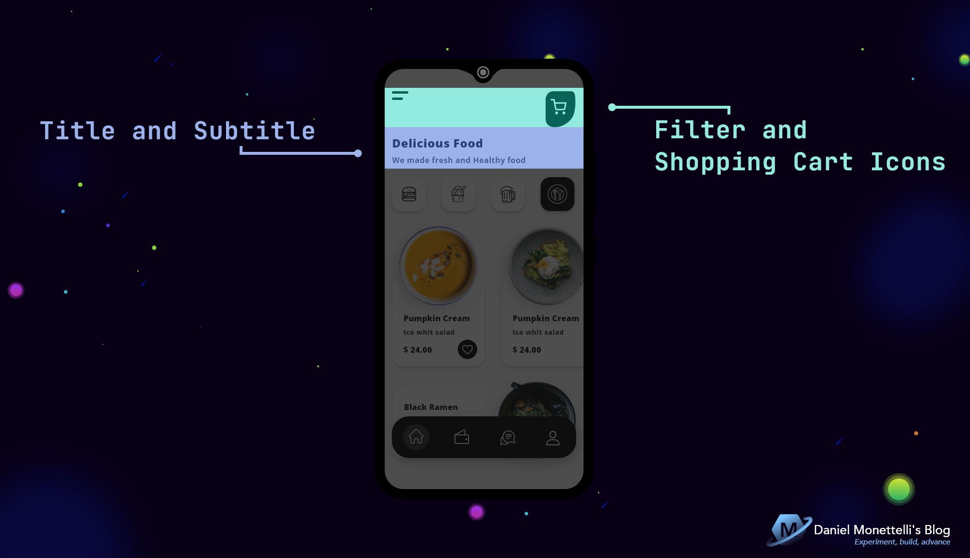 Top Icons and Label Design
Thanks to my method of proportions it is so easy to place the Image and Label controls.
1
2
3
4
5
6
7
8
9
10
11
12
13
14
15
16
17
18
19
20
21
22
23
24
25
26
<!--  Top Icons and Labels  -->
<Image
    Grid.Row="1"
    Grid.Column="1"
    Source="{StaticResource icon_filter_line}" />

<Image
    Grid.Row="1"
    Grid.RowSpan="2"
    Grid.Column="3"
    Source="{StaticResource icon_shopping_cart_line}" />

<Label
    Grid.Row="4"
    Grid.Column="1"
    Grid.ColumnSpan="2"
    Text="Delicious Food"
    Style="{StaticResource TxtHeadLine5_1}" />

<Label
    Grid.Row="6"
    Grid.Column="1"
    Grid.ColumnSpan="2"
    MaxLines="2"
    Text="We made fresh and Healthy food"
    Style="{StaticResource TxtSubtitle1_1}" />
Category List
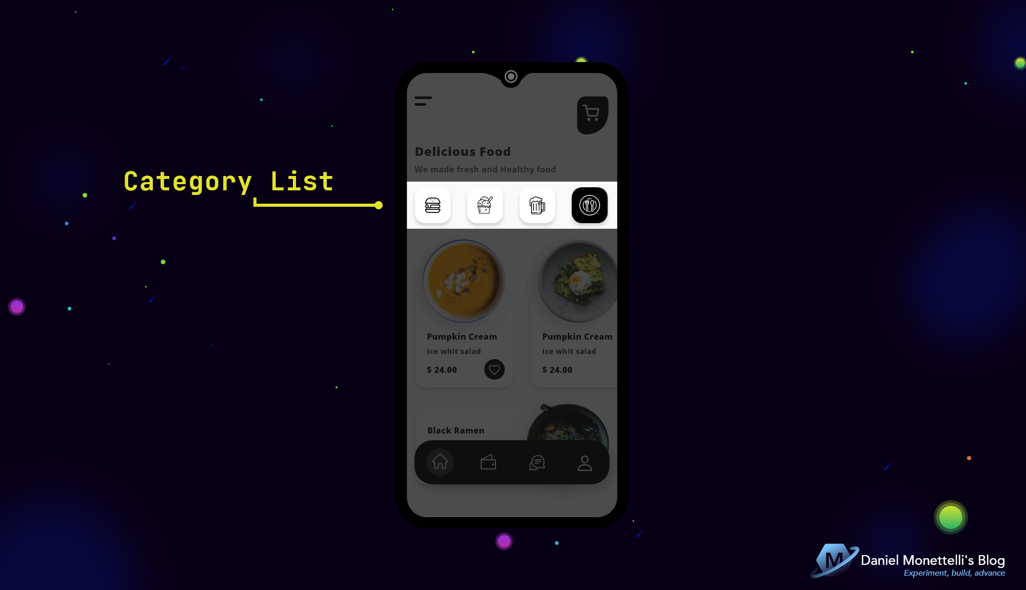 Category List Design
The list of food categories has FlexLayout as its parent whose content is linked to a collection of items through BindableLayout, each item is encapsulated with PancakeView and its icons are Embedded Fonts.
1
2
3
4
5
6
7
8
9
10
11
12
13
14
15
16
17
18
19
20
21
22
23
24
25
26
27
28
29
30
31
32
33
34
35
36
37
38
39
<!--  Category List  -->
<FlexLayout
    x:Name="CategoryList"
    Grid.Row="8"
    Grid.Column="1"
    Grid.ColumnSpan="3"
    Direction="Row"
    JustifyContent="SpaceBetween"
    BindableLayout.ItemsSource="{Binding Categories}">
    <BindableLayout.ItemTemplate>
        <DataTemplate>
            <yummy:PancakeView
                CornerRadius="20"
                WidthRequest="70"
                HasShadow="True"
                Style="{StaticResource vsm_surfaceCategory}">
                <yummy:PancakeView.GestureRecognizers>
                    <TapGestureRecognizer Tapped="SelectedCategory_Tapped" />
                </yummy:PancakeView.GestureRecognizers>
                <StackLayout
                    VerticalOptions="FillAndExpand"
                    HorizontalOptions="FillAndExpand">
                    <Label
                        x:Name="ImageCategory"
                        HorizontalOptions="CenterAndExpand"
                        VerticalOptions="CenterAndExpand"
                        Text="{Binding Image_Category}"
                        FontFamily="MonettelliFontIcons"
                        FontSize="40"
                        Style="{StaticResource vsm_labelCategory}" />
                    <Label
                        x:Name="LabelCategory"
                        IsVisible="false"
                        Text="{Binding Name_Category}" />
                </StackLayout>
            </yummy:PancakeView>
        </DataTemplate>
    </BindableLayout.ItemTemplate>
</FlexLayout>
In the HomeViewModel class, the Categories collection is instantiated in the constructor by adding the name and the corresponding Font Icons.
The GetItemsForCategory( ) method will first clear the list, then the items variable starts a search action for Name_VarietyFood depending on the selected Category, at the end ToList( ) converts it from IEnumerable to List, then if there is a Category selected, we update the new added items in a foreach loop.
1
2
3
4
5
6
7
8
9
10
11
12
13
14
15
16
17
18
19
20
21
22
23
24
25
26
27
28
29
30
31
32
33
34
35
36
37
38
39
40
41
42
43
44
45
46
47
48
49
50
51
52
53
54
55
public class HomeViewModel : BaseViewModel
{

    // ...

    public ObservableRangeCollection<Category> Categories { get; set; }

    // ...

    public HomeViewModel()
    {

        //...

        Categories = new ObservableRangeCollection<Category>
        {
            new Category
            {
                Name_Category="Fast food",
                Image_Category=MonettelliFontIcons.icon_fast_food_line
            },
            new Category
            {
                Name_Category="Dessert",
                Image_Category=MonettelliFontIcons.icon_dessert_line
            },
            new Category
            {
                Name_Category="Beer",
                Image_Category=MonettelliFontIcons.icon_beer_line
            },
            new Category
            {
                Name_Category="Gourmet Food",
                Image_Category=MonettelliFontIcons.icon_gourmet_food_line
            },

        };

       // ...

    }

    public void GetItemsForCategory(string obj, bool isSelected)
    {
        DynamicFoods.Clear();
        var items = Foods.Where(f => f.VarietyFoods.Name_VarietyFood.Contains(obj)).ToList();
        if(isSelected == true)
        foreach (var item in items)
        {
            DynamicFoods.Add(new FoodsViewModel(item));
        }
    }

}
The FoodsViewModel class is responsible for refreshing the changes of the public properties of the DynamicFoods list thanks to the SetProperty( ) method, part of the MVVM Helpers nuget package, in the constructor these initial properties are instantiated with the data members of the Food class.
1
2
3
4
5
6
7
8
9
10
11
12
13
14
15
16
17
18
19
20
21
22
23
24
25
26
27
28
29
30
31
32
33
34
35
36
37
38
39
40
41
42
43
44
45
46
47
48
49
50
51
52
53
54
55
56
57
public class FoodsViewModel : BaseViewModel
{

    private VarietyFood varietyFoods;
    private string name_food;
    private string image_food;
    private double price_food;
    private string short_description_food;
    private string long_description_food;

    public VarietyFood VarietyFoods
    {
        get { return varietyFoods; }
        set { SetProperty(ref varietyFoods, value); }
    }

    public string Name_Food
    {
        get { return name_food; }
        set { SetProperty(ref name_food, value); }
    }

    public string Image_Food
    {
        get { return image_food; }
        set { SetProperty(ref image_food, value); }
    }

    public double Price_Food
    {
        get { return price_food; }
        set { SetProperty(ref price_food, value); }
    }

    public string Short_Description_Food
    {
        get { return short_description_food; }
        set { SetProperty(ref short_description_food, value); }
    }

    public string Long_Description_Food
    {
        get { return long_description_food; }
        set { SetProperty(ref long_description_food, value); }
    }

    public FoodsViewModel(Food food)
    {
        VarietyFoods = food.VarietyFoods;
        Name_Food = food.Name_Food;
        Image_Food = food.Image_Food;
        Price_Food = food.Price_Food;
        Short_Description_Food = food.Short_Description_Food;
        Long_Description_Food = food.Long_Description_Food;
    }

}
The HomeViewModel is bound with the BindingContext and a private keyword from that ViewModel, which will be used in the ChangeFontIconColor( ) method.
The ChangeFontIconColor( ) method consists of two variables similar to x:Name, the first indicates the category icon, while the second links the Name_Category(see HomePage.xaml), the string variable visualState makes use of a ternary operator, whose strings are the states assigned by VSM, the GoToState( ) method activates these states, finally, the GetItemsForCategory( ) method will take care of displaying the items based on the labelCategory.Text.
The SelectedCategory_Tapped( ) event consists of two variables, the first one casts a VisualElement(or the name of the layout of said event) and the second one casts but the collection’s parent layout (FlexLayout). For the non-selected items in the category list to be in “normal” mode, we use the foreach loop to the parent.Children list, finally, we add the methods with “Selected” states.
1
2
3
4
5
6
7
8
9
10
11
12
13
14
15
16
17
18
19
20
21
22
23
24
25
26
27
28
29
30
31
32
33
34
35
36
37
38
public partial class HomePage : ContentPage
{
    private HomeViewModel homeViewModel;

    public HomePage()
    {
        InitializeComponent();

        BindingContext = homeViewModel = new HomeViewModel();

        // ...
    }

    // ...

    private void SelectedCategory_Tapped(object sender, EventArgs e)
    {
        var surfaceCategory = sender as VisualElement;
        var parent = surfaceCategory.Parent as FlexLayout;
        foreach (View child in parent.Children)
        {
            VisualStateManager.GoToState(child, "Normal");
            ChangeFontIconColor(child, false);
        }
        VisualStateManager.GoToState(surfaceCategory, "Selected");
        ChangeFontIconColor(surfaceCategory, true);
    }

    void ChangeFontIconColor(VisualElement child, bool isSelected)
    {
        var imageCategory = child.FindByName<Label>("ImageCategory");
        var labelCategory = child.FindByName<Label>("LabelCategory");
        string visualState = isSelected ? "Selected" : "Normal";
        VisualStateManager.GoToState(imageCategory, visualState);
        homeViewModel.GetItemsForCategory(labelCategory.Text, isSelected);
    }

}
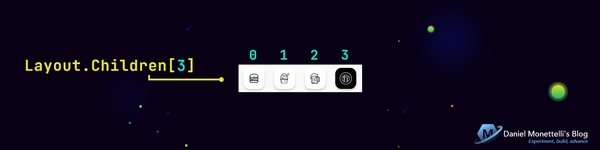 Layout.Children in Category List
The FilterCategory( ) method is responsible for selecting a category automatically when the application is opened, in the SelectedCategory_Tapped( ) event, the sender parameter is activated with Layout.Children[ ] indicating the category number in the array, finally, it is said instance method in the constructor.
1
2
3
4
5
6
7
8
9
10
11
12
13
14
15
16
17
18
19
20
21
22
23
24
public partial class HomePage : ContentPage
{
    // ...

    public HomePage()
    {
        InitializeComponent();

        // ...

        FilterCategory();
    }

    void FilterCategory()
    {
        SelectedCategory_Tapped(CategoryList.Children[3], null);
    }

    private void SelectedCategory_Tapped(object sender, EventArgs e)
    {
        // ...
    }

}
Dynamic Food List
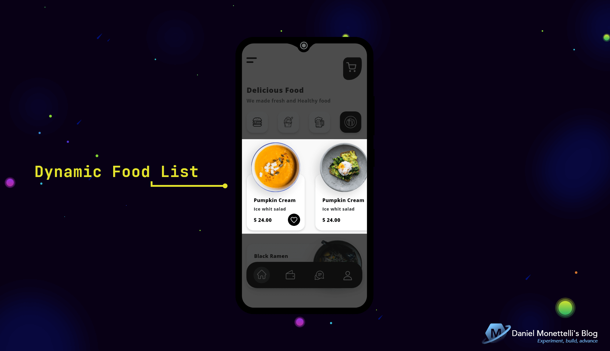 Dynamic Food List Design
This dynamic list uses CollectionView, its orientation is horizontal, it has two proportional layers for the food image that is above the child Frame, and they are optimized thanks to the FFImageLoading nuget package.
1
2
3
4
5
6
7
8
9
10
11
12
13
14
15
16
17
18
19
20
21
22
23
24
25
26
27
28
29
30
31
32
33
34
35
36
37
38
39
40
41
42
43
44
45
46
47
48
49
50
51
52
53
54
55
56
57
58
59
60
61
62
63
64
65
66
67
68
69
70
71
72
73
74
75
76
77
78
79
80
81
82
83
84
85
86
87
88
89
90
91
92
93
94
95
96
97
98
99
100
101
102
103
104
105
106
107
108
109
110
111
112
113
114
115
116
117
118
119
120
121
122
123
124
125
126
127
128
129
130
131
132
133
134
135
<!--  Dynamic Food List  -->
<CollectionView
    x:Name="collectionView_MicunaFood"
    Grid.Row="10"
    Grid.Column="1"
    Grid.ColumnSpan="4"
    ItemsSource="{Binding DynamicFoods}"
    SelectionMode="Single"
    HeightRequest="288">
    <CollectionView.ItemsLayout>
        <GridItemsLayout
            Orientation="Horizontal"
            HorizontalItemSpacing="35" />
    </CollectionView.ItemsLayout>
    <CollectionView.ItemTemplate>
        <DataTemplate>
            <Grid WidthRequest="190">
                <Grid.RowDefinitions>
                    <!--  0  -->
                    <RowDefinition Height="103" />
                    <!--  1  -->
                    <RowDefinition Height="59" />
                    <!--  2  -->
                    <RowDefinition Height="126" />
                </Grid.RowDefinitions>
                <Grid.ColumnDefinitions>
                    <!--  0  -->
                    <ColumnDefinition Width="15" />
                    <!--  1  -->
                    <ColumnDefinition Width="160" />
                    <!--  2  -->
                    <ColumnDefinition Width="15" />
                </Grid.ColumnDefinitions>
                <Frame
                    Grid.Row="1"
                    Grid.RowSpan="2"
                    Grid.Column="0"
                    Grid.ColumnSpan="3"
                    CornerRadius="20">
                    <Frame.Background>
                        <LinearGradientBrush StartPoint="0,0" EndPoint="1,0">
                            <GradientStop Offset="0.1" Color="{StaticResource colStartSurf1}" />
                            <GradientStop Offset="1.0" Color="{StaticResource colEndSurf1}" />
                        </LinearGradientBrush>
                    </Frame.Background>
                    <Grid>
                        <Grid.RowDefinitions>
                            <!--  0  -->
                            <RowDefinition Height="0.32*" />
                            <!--  1  -->
                            <RowDefinition Height="0.086*" />
                            <!--  2  -->
                            <RowDefinition Height="Auto" />
                            <!--  3  -->
                            <RowDefinition Height="0.043*" />
                            <!--  4  -->
                            <RowDefinition Height="Auto" />
                            <!--  5  -->
                            <RowDefinition Height="0.032*" />
                            <!--  6  -->
                            <RowDefinition Height="0.054*" />
                            <!--  7  -->
                            <RowDefinition Height="Auto" />
                            <!--  8  -->
                            <RowDefinition Height="0.043*" />
                            <!--  9  -->
                            <RowDefinition Height="0.079*" />
                        </Grid.RowDefinitions>
                        <Grid.ColumnDefinitions>
                            <!--  0  -->
                            <ColumnDefinition Width="0.08*" />
                            <!--  1  -->
                            <ColumnDefinition Width="0.042*" />
                            <!--  2  -->
                            <ColumnDefinition Width="0.462*" />
                            <!--  3  -->
                            <ColumnDefinition Width="0.126*" />
                            <!--  4  -->
                            <ColumnDefinition Width="0.168*" />
                            <!--  5  -->
                            <ColumnDefinition Width="0.042*" />
                            <!--  6  -->
                            <ColumnDefinition Width="0.08*" />
                        </Grid.ColumnDefinitions>
                        <Label
                            Grid.Row="2"
                            Grid.Column="2"
                            Grid.ColumnSpan="3"
                            Text="{Binding Name_Food}"
                            Style="{StaticResource TxtSubtitle1_2}" />
                        <Label
                            Grid.Row="4"
                            Grid.Column="2"
                            Grid.ColumnSpan="3"
                            MaxLines="2"
                            Text="{Binding Short_Description_Food}"
                            Style="{StaticResource TxtSubtitle2_1}" />
                        <Label
                            Grid.Row="7"
                            Grid.Column="2"
                            Text="{Binding Price_Food, StringFormat='{0:C2}'}"
                            Style="{StaticResource TxtSubtitle1_2}" />
                        <yummy:PancakeView
                            Grid.Row="6"
                            Grid.RowSpan="3"
                            Grid.Column="4"
                            Grid.ColumnSpan="2"
                            CornerRadius="80"
                            BackgroundColor="{DynamicResource colPrim}">
                            <Image
                                Grid.Row="0"
                                Grid.RowSpan="2"
                                Grid.Column="1"
                                HorizontalOptions="Center"
                                VerticalOptions="Center"
                                TranslationY="1"
                                TranslationX="1"
                                Source="{StaticResource icon_heart_line}" />
                        </yummy:PancakeView>
                    </Grid>
                </Frame>
                <ffimageloading:CachedImage
                    Grid.Row="0"
                    Grid.RowSpan="2"
                    Grid.Column="1"
                    CacheDuration="30"
                    DownsampleToViewSize="True"
                    FadeAnimationForCachedImages="True"
                    FadeAnimationEnabled="True"
                    FadeAnimationDuration="100"
                    Source="{Binding Image_Food}" />
            </Grid>
        </DataTemplate>
    </CollectionView.ItemTemplate>
</CollectionView>
In HomeViewModel, the public collection DynamicFoods is created and then instantiated in the constructor.
1
2
3
4
5
6
7
8
9
10
11
12
13
14
15
16
17
18
public class HomeViewModel : BaseViewModel
{

    // ...

    public ObservableRangeCollection<FoodsViewModel> DynamicFoods { get; set; }

    public HomeViewModel()
    {

        DynamicFoods = new ObservableRangeCollection<FoodsViewModel>();

        // ...

    }

    // ...
}
List of All Foods
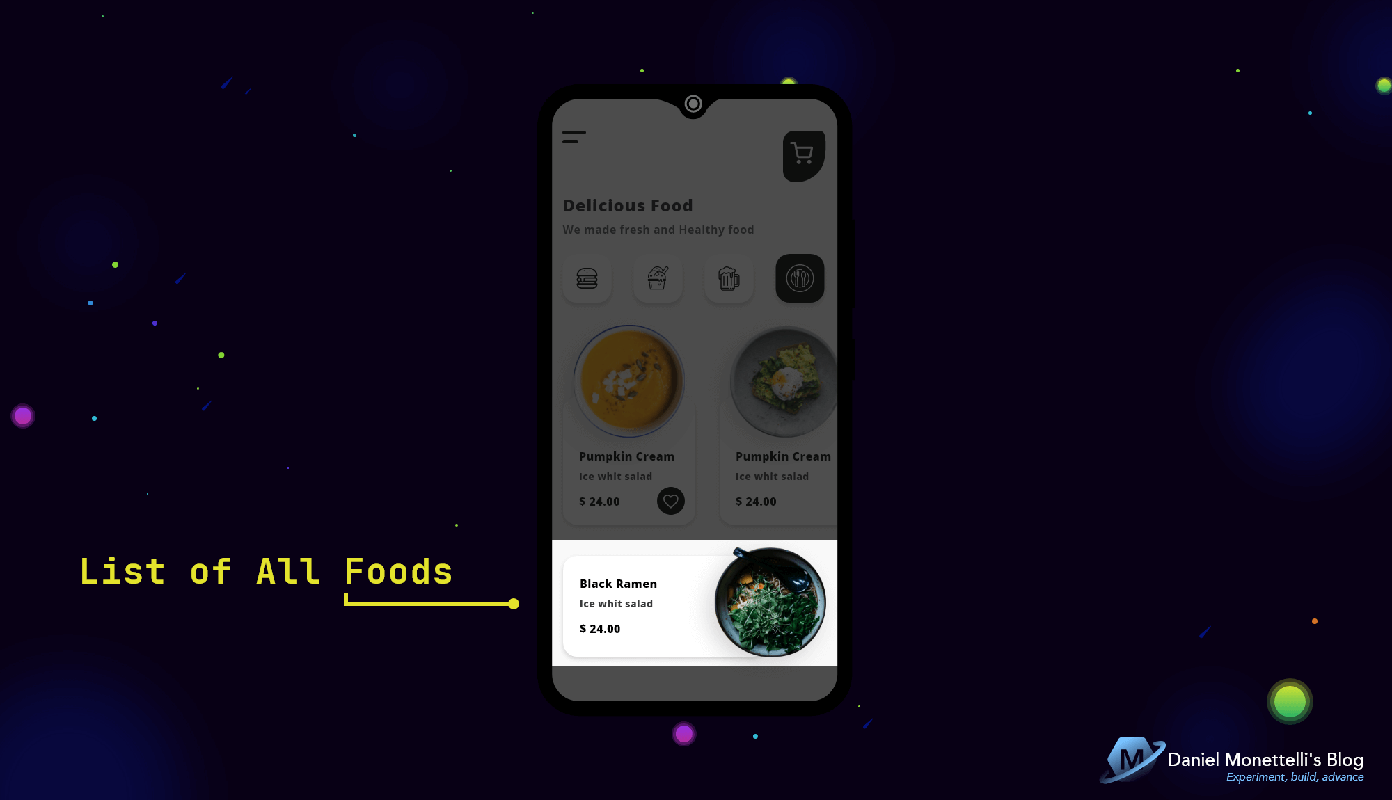 List of All Foods Design
This list is static, it is inside a CarouselView, its orientation is horizontal, it has two proportional layers since the image of the food protrudes a little from the Child Frame, it is also optimized with FFImageLoading.
1
2
3
4
5
6
7
8
9
10
11
12
13
14
15
16
17
18
19
20
21
22
23
24
25
26
27
28
29
30
31
32
33
34
35
36
37
38
39
40
41
42
43
44
45
46
47
48
49
50
51
52
53
54
55
56
57
58
59
60
61
62
63
64
65
66
67
68
69
70
71
72
73
74
75
76
77
78
79
80
81
82
83
84
85
86
87
88
89
90
91
92
93
94
95
96
97
98
99
100
101
102
<!--  List of All Foods  -->
<CarouselView
    x:Name="carouselView_MicunaFood"
    Grid.Row="12"
    Grid.Column="1"
    Grid.ColumnSpan="3"
    HeightRequest="157"
    ItemsSource="{Binding Foods}">
    <CarouselView.ItemsLayout>
        <LinearItemsLayout
            Orientation="Horizontal"
            SnapPointsType="MandatorySingle" />
    </CarouselView.ItemsLayout>
    <CarouselView.ItemTemplate>
        <DataTemplate>
            <Grid>
                <Grid.RowDefinitions>
                    <!--  0  -->
                    <RowDefinition Height="0.076*" />
                    <!--  1  -->
                    <RowDefinition Height="0.924*" />
                </Grid.RowDefinitions>
                <Grid.ColumnDefinitions>
                    <!--  0  -->
                    <ColumnDefinition Width="0.577*" />
                    <!--  1  -->
                    <ColumnDefinition Width="0.196*" />
                    <!--  2  -->
                    <ColumnDefinition Width="0.227*" />
                </Grid.ColumnDefinitions>
                <Frame
                    Grid.Row="1"
                    Grid.Column="0"
                    Grid.ColumnSpan="2"
                    CornerRadius="20"
                    HeightRequest="145">
                    <Frame.Background>
                        <LinearGradientBrush StartPoint="0,0" EndPoint="1,0">
                            <GradientStop Offset="0.1" Color="{StaticResource colStartSurf1}" />
                            <GradientStop Offset="1.0" Color="{StaticResource colEndSurf1}" />
                        </LinearGradientBrush>
                    </Frame.Background>
                    <Grid>
                        <Grid.RowDefinitions>
                            <!--  0  -->
                            <RowDefinition Height="0.2*" />
                            <!--  1  -->
                            <RowDefinition Height="Auto" />
                            <!--  2  -->
                            <RowDefinition Height="0.055*" />
                            <!--  3  -->
                            <RowDefinition Height="Auto" />
                            <!--  4  -->
                            <RowDefinition Height="0.11*" />
                            <!--  5  -->
                            <RowDefinition Height="Auto" />
                            <!--  6  -->
                            <RowDefinition Height="0.2*" />
                        </Grid.RowDefinitions>
                        <Grid.ColumnDefinitions>
                            <!--  0  -->
                            <ColumnDefinition Width="23" />
                            <!--  1  -->
                            <ColumnDefinition Width="0.49*" />
                            <!--  2  -->
                            <ColumnDefinition Width="0.064*" />
                            <!--  3  -->
                            <ColumnDefinition Width="0.422*" />
                        </Grid.ColumnDefinitions>
                        <Label
                            Grid.Row="1"
                            Grid.Column="1"
                            Text="{Binding Name_Food}"
                            Style="{StaticResource TxtSubtitle1_2}" />
                        <Label
                            Grid.Row="3"
                            Grid.Column="1"
                            MaxLines="3"
                            Text="{Binding Short_Description_Food}"
                            Style="{StaticResource TxtSubtitle2_1}" />
                        <Label
                            Grid.Row="5"
                            Grid.Column="1"
                            Text="{Binding Price_Food, StringFormat='{0:C2}'}"
                            Style="{StaticResource TxtSubtitle1_2}" />
                    </Grid>
                </Frame>
                <ffimageloading:CachedImage
                    Grid.Row="0"
                    Grid.RowSpan="2"
                    Grid.Column="1"
                    Grid.ColumnSpan="2"
                    CacheDuration="30"
                    DownsampleToViewSize="True"
                    FadeAnimationForCachedImages="True"
                    FadeAnimationEnabled="True"
                    FadeAnimationDuration="100"
                    Source="{Binding Image_Food}" />
            </Grid>
        </DataTemplate>
    </CarouselView.ItemTemplate>
</CarouselView>
In HomeViewModel, the public Foods collection is created and then instantiated in the constructor adding all the data for each property.
1
2
3
4
5
6
7
8
9
10
11
12
13
14
15
16
17
18
19
20
21
22
23
24
25
26
27
28
29
30
31
32
33
34
public class HomeViewModel : BaseViewModel
{

    public ObservableRangeCollection<Food> Foods { get; set; }

    // ...

    public HomeViewModel()
    {

        Foods = new ObservableRangeCollection<Food>
        {
            new Food
            {
                Id=1,
                VarietyFoods=new VarietyFood
                {
                      Name_VarietyFood="Fast food",
                      Image_VarietyFood=MonettelliFontIcons.icon_fast_food_line
                },
                Name_Food="Black ramen",
                Image_Food="https://raw.githubusercontent.com/danielmonettelli/Area51/main/Foods/img_black_ramen.png",
                Price_Food=30.00,
                Short_Description_Food="Thick and milky broth with an intense flavor.",
                Long_Description_Food="Our Hakata Black Ramen is a rich and thick stock tonkotsu ramen typical of the Hakata area, in Fukuoka (south of the country), which is made by cooking pork bones for hours to obtain a thick and milky broth with an intense flavor that is It is accompanied by strong flavors such as garlic or ginger, resulting in a powerful umami."
            },

            // more food items...
        };
    }

    // ...

}
Elegant TabView
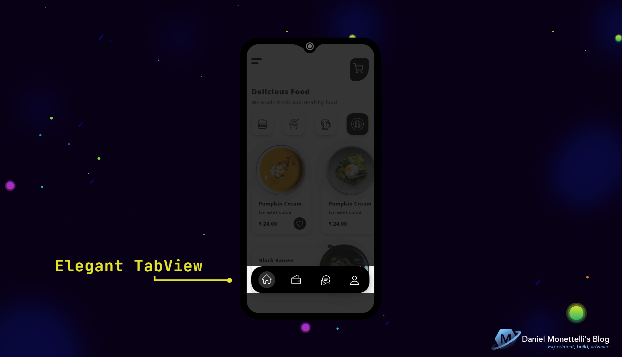 Elegant TabView Design
To create this great floating button style TabView I used the Sharpnado.Tabs nuget package, a steroidal layout, fully customizable and with excellent performance.
1
2
3
4
5
6
7
8
9
10
11
12
13
14
15
16
17
18
19
20
21
22
23
24
25
26
27
28
29
30
31
32
33
34
35
36
37
38
39
40
41
<Grid>

    <!--  ...  -->

    <!--  Elegant TabView  -->
    <tabs:TabHostView
        Grid.Row="1"
        Grid.Column="1"
        HeightRequest="86"
        CornerRadius="35"
        IsSegmented="True"
        Shades="{sh:ShadeStack}"
        BackgroundColor="{DynamicResource colPrim}"
        TabType="Fixed">

        <tabs:TabHostView.Tabs>

            <tabs:BottomTabItem
                IconImageSource="{StaticResource icon_tab_home_line}"
                IsTextVisible="False"
                SelectedTabColor="{DynamicResource colTer}" />

            <tabs:BottomTabItem
                IconImageSource="{StaticResource icon_tab_wallet_line}"
                IsTextVisible="False"
                SelectedTabColor="{DynamicResource colTer}" />

            <tabs:BottomTabItem
                IconImageSource="{StaticResource icon_tab_conversation_line}"
                IsTextVisible="False"
                SelectedTabColor="{DynamicResource colTer}" />

            <tabs:BottomTabItem
                IconImageSource="{StaticResource icon_tab_user_line}"
                IsTextVisible="False"
                SelectedTabColor="{DynamicResource colTer}" />

        </tabs:TabHostView.Tabs>
    </tabs:TabHostView>

</Grid>
The Result
Get the Code
All the code is open source, you can see it by clicking the following image:

Resources
- MonettelliUIKIT.
- Xamarin.Forms Visual State Manager.
- Xamarin.Forms FlexLayout.
- Sharpnado.Tabs.
- Xamarin.Forms.PancakeView.
- Dribbble.
- Unsplash.
- Pexels.
Conclusions
I really enjoyed the challenge, I made use of collections in C#, a feature that we will see in all applications and that it is important to know how to use them to interact with the data of an API, a local json, etc. Regarding the interface, I am amazed by the power that Visual State Manager has, I will take it into account in the next versions of MonettelliUIKIT. Thank you very much for viewing this post, see you in the next part.