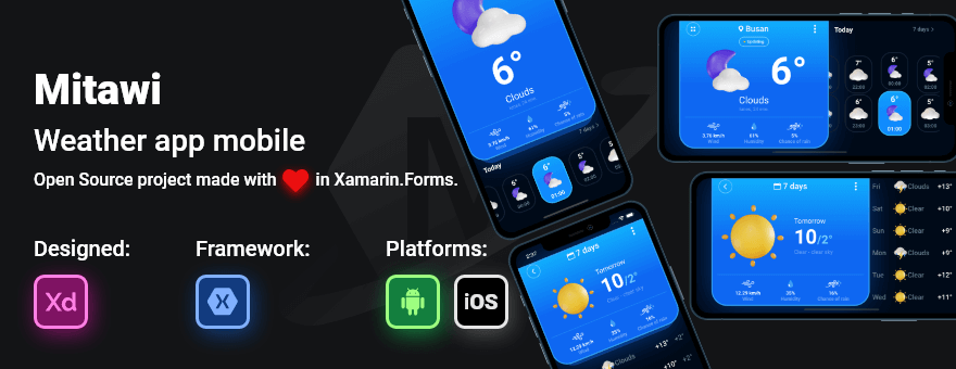
Xamarin.Forms UI/UX Challenges - Mitawi Weather
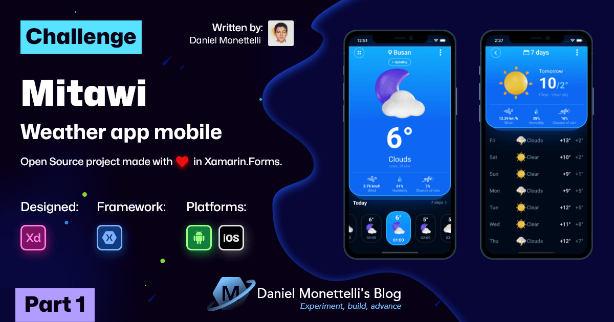
Can Xamarin.Forms and .NET MAUI build flexible apps for all physical devices? Of course it's a big YES, but it all depends on the method being applied and the design being worked on.
What a mess I’ve gotten myself into! And it is that adapting an application for all physical devices (phones, tablets, etc.) with their different sizes of text and images is quite a challenge for the design and development area. However, the viability of the application depends of certain criteria, and based on my little or a lot of experience I will try to explain in this publication.
Inspirational Design
Mitawi Weather is inspired by the design of Vitaliy Dorozhko (Co-Founder MoreThan Agency), it consists of two beautiful interfaces, one to interact with the daily weather and another to observe the weekly weather. Vitaliy is known for embellishing his designs with bold colors and gradients, enhancing each component in a unique way and achieving an unrivaled user experience, great job Vitaliy!
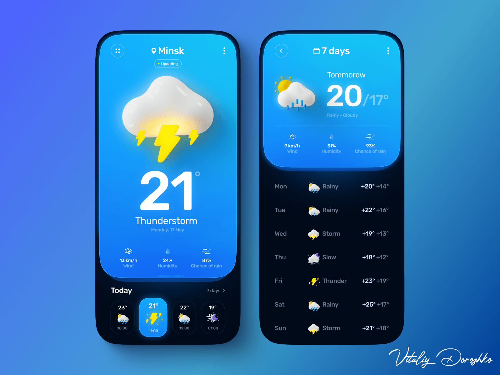 Design created by Vitaliy Dorozhko (Co-Founder MoreThan Agency)
Application structure
Mitawi Weather uses Visual State Manager to manage the orientation of its interfaces, as it allows visual changes to controls based on portrait and landscape states. It should be noted that these states are customized by the developer and unfortunately they do not come by default.
Since VSM hosts a variety of properties, it is recommended to define them in styles and implement them in resource dictionaries, which will be located in the “Views/Orientations” folder.
 Orientations Location
… then we add in each interface the resource dictionary path.
1
2
3
4
5
6
7
8
9
<ContentPage>

    <ContentPage.Resources>
        <ResourceDictionary Source="Orientations/HomePageOrientation.xaml" />
    </ContentPage.Resources>

    <!-- rest of code... -->

</ContentPage>
1
2
3
4
5
6
7
8
9
<ContentPage>

    <ContentPage.Resources>
        <ResourceDictionary Source="Orientations/HomeDetailPageOrientation.xaml" />
    </ContentPage.Resources>

    <!-- rest of code... -->

</ContentPage>
HomePage Structure
The HomePage interface is composed in the first instance by a GridLayout, inside it houses two PancakeViews in charge of giving it that three-dimensional appearance and whose objective is to outline its respective content.
1
2
3
4
5
6
7
8
9
10
11
12
13
14
15
16
17
18
19
20
21
22
23
24
25
26
27
28
29
30
31
32
33
34
35
36
37
38
39
40
41
42
43
44
45
46
47
48
        <!--#region Grid Parent-->
        <Grid
            x:Name="gridParent"
            Style="{StaticResource vsm_orientation_gridParent}">

            <!--#region Top layer lower 1-->
            <yummy:PancakeView
                x:Name="topLayerLower1"
                BackgroundColor="{StaticResource col_thirt}"
                CornerRadius="0,0,43,43"
                Shadow="{yummy:ShadowMarkup Color={StaticResource col_thirt},
                                            Opacity=0.93,
                                            BlurRadius=45}"
                Style="{StaticResource vsm_orientation_topLayerLower1}" />
            <!--#endregion-->

            <!--#region Top layer higher 2-->
            <yummy:PancakeView
                x:Name="topLayerHigher2"
                BackgroundGradientEndPoint="0,1"
                BackgroundGradientStartPoint="0,0"
                Border="{yummy:BorderMarkup Color={StaticResource col_twel},
                                            Thickness=3}"
                CornerRadius="0,0,45,45"
                Style="{StaticResource vsm_orientation_topLayerHigher2}">
                <yummy:PancakeView.BackgroundGradientStops>
                    <yummy:GradientStopCollection>
                        <yummy:GradientStop
                            Offset="0"
                            Color="{StaticResource col_prim}" />
                        <yummy:GradientStop
                            Offset="0.5"
                            Color="{StaticResource col_sec}" />
                    </yummy:GradientStopCollection>
                </yummy:PancakeView.BackgroundGradientStops>

                <Grid
                    x:Name="gridAdminTopLayerHigher2"
                    Padding="16,0"
                    Style="{StaticResource vsm_orientation_gridAdminTopLayerHigher2}">

                <!-- Respective content... -->

                </Grid>
            </yummy:PancakeView>
            <!--#endregion-->
        </Grid>
        <!--#endregion-->
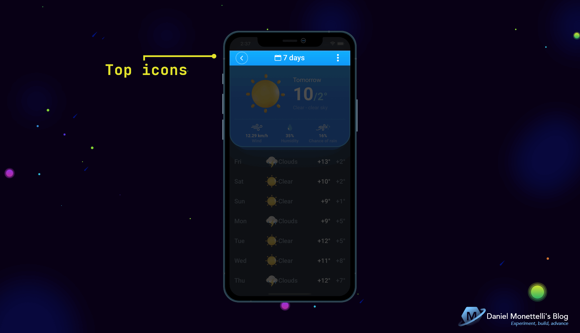
Top icons in HomePage
 Top Icons in HomePage
This region contains 3 icons and a label indicating the user’s city.
1
2
3
4
5
6
7
8
9
10
11
12
13
14
15
16
17
18
19
20
21
22
23
24
25
26
27
28
29
30
31
32
33
34
35
36
37
38
39
40
41
42
43
44
45
46
47
<!--#region Top icons-->
<yummy:PancakeView
    Grid.Row="0"
    Grid.Column="0"
    xct:TouchEffect.AnimationDuration="300"
    xct:TouchEffect.NativeAnimation="True"
    xct:TouchEffect.PressedBackgroundColor="#171D59"
    CornerRadius="8,8,8,8">

    <Image
        HeightRequest="40"
        HorizontalOptions="Center"
        Source="svg_main_list_outline.png"
        VerticalOptions="CenterAndExpand"
        WidthRequest="40" />
</yummy:PancakeView>

<StackLayout
    x:Name="iconAndTextLocation"
    HorizontalOptions="CenterAndExpand"
    Orientation="Horizontal"
    Spacing="6"
    Style="{StaticResource vsm_orientation_iconAndTextLocation}"
    VerticalOptions="CenterAndExpand">

    <Image Source="{OnIdiom Phone={OnPlatform Default={StaticResource icon_location_solid_phone}}, Tablet={OnPlatform Default={StaticResource icon_location_solid_tablet}}}" />

    <Label
        Style="{OnIdiom Phone={OnPlatform Default={StaticResource TxtHeadline5_1}},
                        Tablet={OnPlatform Default={StaticResource TxtHeadline4_3}}}"
        Text="{Binding MyPlacemark.AdminArea}" />
</StackLayout>

<yummy:PancakeView
    x:Name="iconPicker"
    xct:TouchEffect.AnimationDuration="300"
    xct:TouchEffect.NativeAnimation="True"
    xct:TouchEffect.PressedBackgroundColor="#171D59"
    CornerRadius="8,8,8,8"
    Style="{StaticResource vsm_orientation_iconPicker}">

    <Image
        HorizontalOptions="Center"
        Source="{StaticResource icon_picker_solid}"
        VerticalOptions="CenterAndExpand" />
</yummy:PancakeView>
<!--#endregion-->
Updating
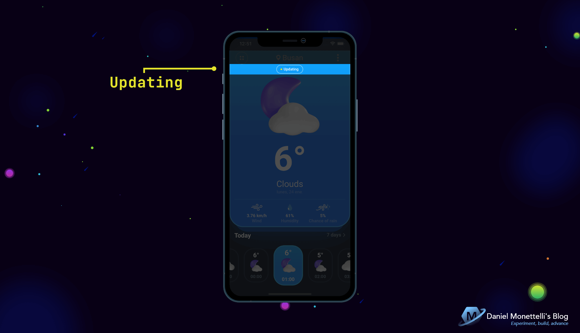 Updating in HomePage
This region contains a button that simulates updating the weather information.
1
2
3
4
5
6
7
8
9
10
11
12
13
14
15
16
17
18
19
20
21
22
23
24
25
26
27
28
29
30
31
32
33
34
35
36
37
38
<!--#region Updating-->
<yummy:PancakeView
    x:Name="updating"
    Margin="0,-2,0,0"
    BackgroundColor="Transparent"
    Border="{yummy:BorderMarkup Color={StaticResource col_ten},
                                Thickness=2}"
    CornerRadius="15,15,15,15"
    HeightRequest="{OnIdiom Phone={OnPlatform Default=29},
                            Tablet={OnPlatform Default=40}}"
    HorizontalOptions="CenterAndExpand"
    Style="{StaticResource vsm_orientation_updating}"
    WidthRequest="{OnIdiom Phone={OnPlatform Default=87},
                           Tablet={OnPlatform Default=108}}">

    <StackLayout
        HorizontalOptions="CenterAndExpand"
        Orientation="Horizontal"
        Spacing="5">

        <BoxView
            BackgroundColor="#FFF10C"
            CornerRadius="{OnIdiom Phone={OnPlatform Default=2.5},
                                   Tablet={OnPlatform Default=3.5}}"
            HeightRequest="{OnIdiom Phone={OnPlatform Default=5},
                                    Tablet={OnPlatform Default=7}}"
            VerticalOptions="Center"
            WidthRequest="{OnIdiom Phone={OnPlatform Default=5},
                                   Tablet={OnPlatform Default=7}}" />

        <Label
            Style="{OnIdiom Phone={OnPlatform Default={StaticResource TxtCaption_1}},
                            Tablet={OnPlatform Default={StaticResource TxtSubtitle1_5}}}"
            Text="Updating"
            VerticalTextAlignment="Center" />
    </StackLayout>
</yummy:PancakeView>
<!--#endregion-->
Weather image
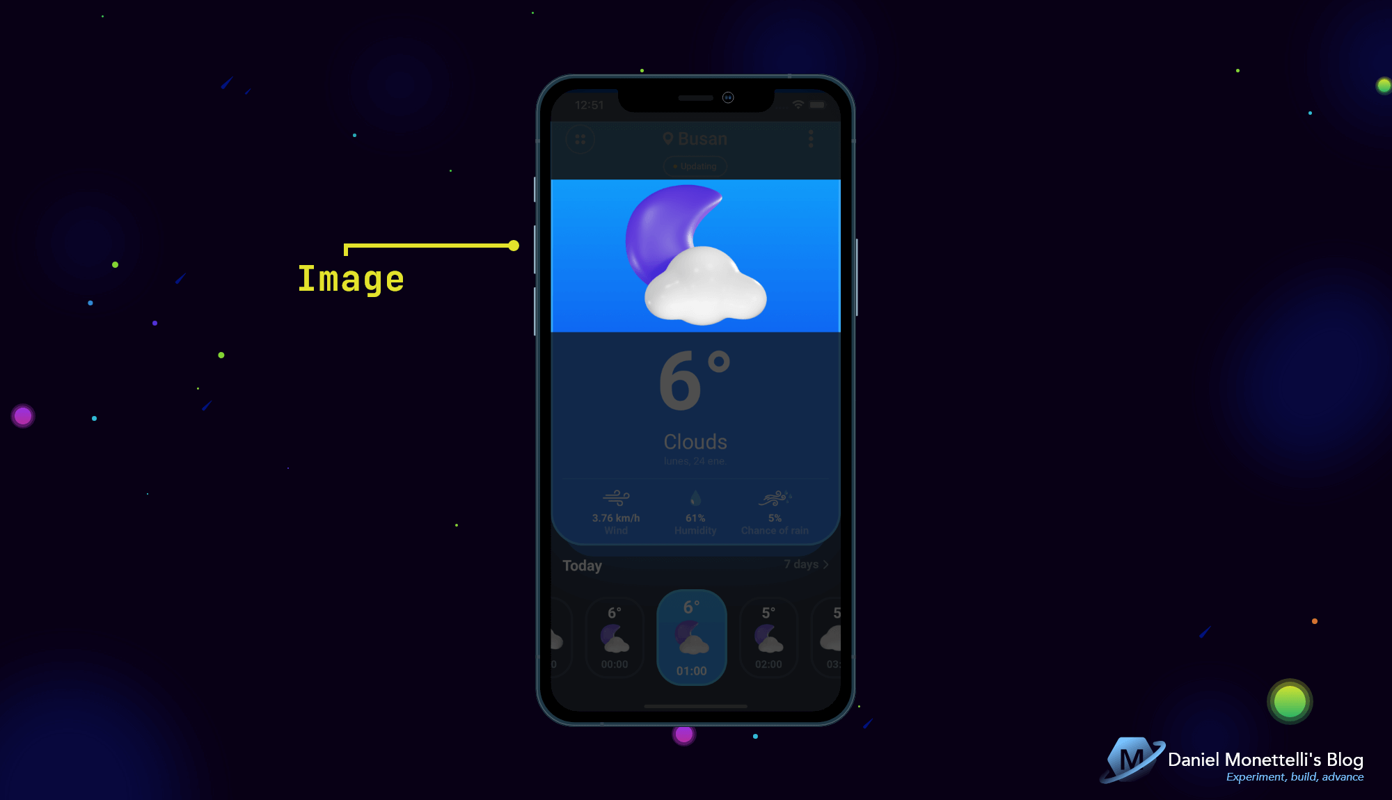 Image in HomePage
This region contains the image of the selected weather.
1
2
3
4
5
6
<!--#region Image-->
<ffimageloading:CachedImage
    Grid.Row="3"
    Grid.Column="1"
    Source="{Binding MyHourly.Weather[0].Icon, Converter={StaticResource CustomImageUrlScalingConverter}, ConverterParameter=10}" />
<!--#endregion-->
Basic description of the climate
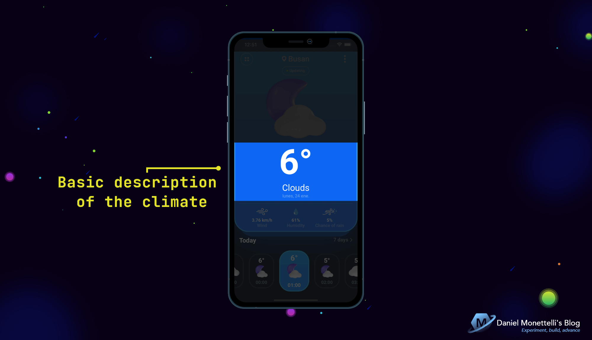 Basic description of the climate
This region contains three labels indicating the temperature, the type of weather and the current date.
1
2
3
4
5
6
7
8
9
10
11
12
13
14
15
16
17
18
19
20
21
22
23
24
25
26
27
28
29
30
31
32
33
<!--#region Basic description of the climate-->
<StackLayout
    x:Name="lookTemperature"
    Style="{StaticResource vsm_orientation_lookTemperature}"
    VerticalOptions="CenterAndExpand">

    <Label
        HorizontalTextAlignment="Center"
        Style="{OnIdiom Phone={OnPlatform Android={StaticResource TxtUnknown1_1},
                                          iOS={StaticResource TxtUnknown1_3}},
                        Tablet={OnPlatform Default={StaticResource TxtUnknown1_5}}}"
        Text="{Binding MyHourly.Temp, StringFormat='{0}°', Converter={StaticResource DoubleToIntConverter}}" />
</StackLayout>

<StackLayout
    x:Name="lookWeatherAndDt"
    Style="{StaticResource vsm_orientation_lookWeatherAndDt}">

    <Label
        HorizontalTextAlignment="Center"
        Style="{OnIdiom Phone={OnPlatform Android={StaticResource TxtHeadline6_1},
                                          iOS={StaticResource TxtUnknown1_4}},
                        Tablet={OnPlatform Default={StaticResource TxtHeadline4_2}}}"
        Text="{Binding MyHourly.Weather[0].Main}" />

    <Label
        Margin="0,1,0,0"
        HorizontalTextAlignment="Center"
        Style="{OnIdiom Phone={OnPlatform Default={StaticResource TxtSubtitle2_1}},
                        Tablet={OnPlatform Default={StaticResource TxtTitle1_1}}}"
        Text="{Binding Days[0].Dt, Converter={StaticResource UnixTimeToDateTimeConverter}, ConverterParameter='dddd, dd MMM'}" />
</StackLayout>
<!--#endregion-->
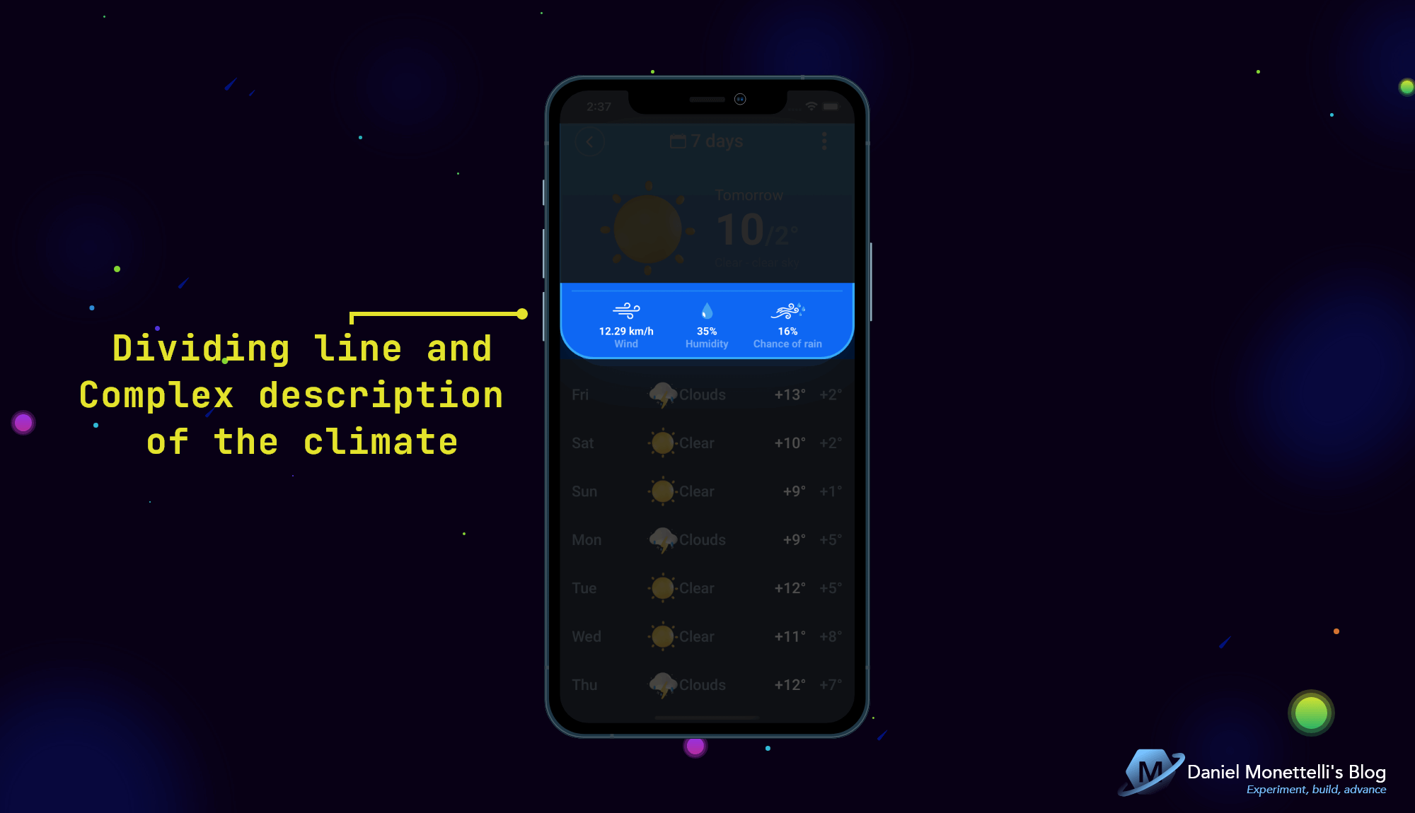
Dividing line and complex description of the climate
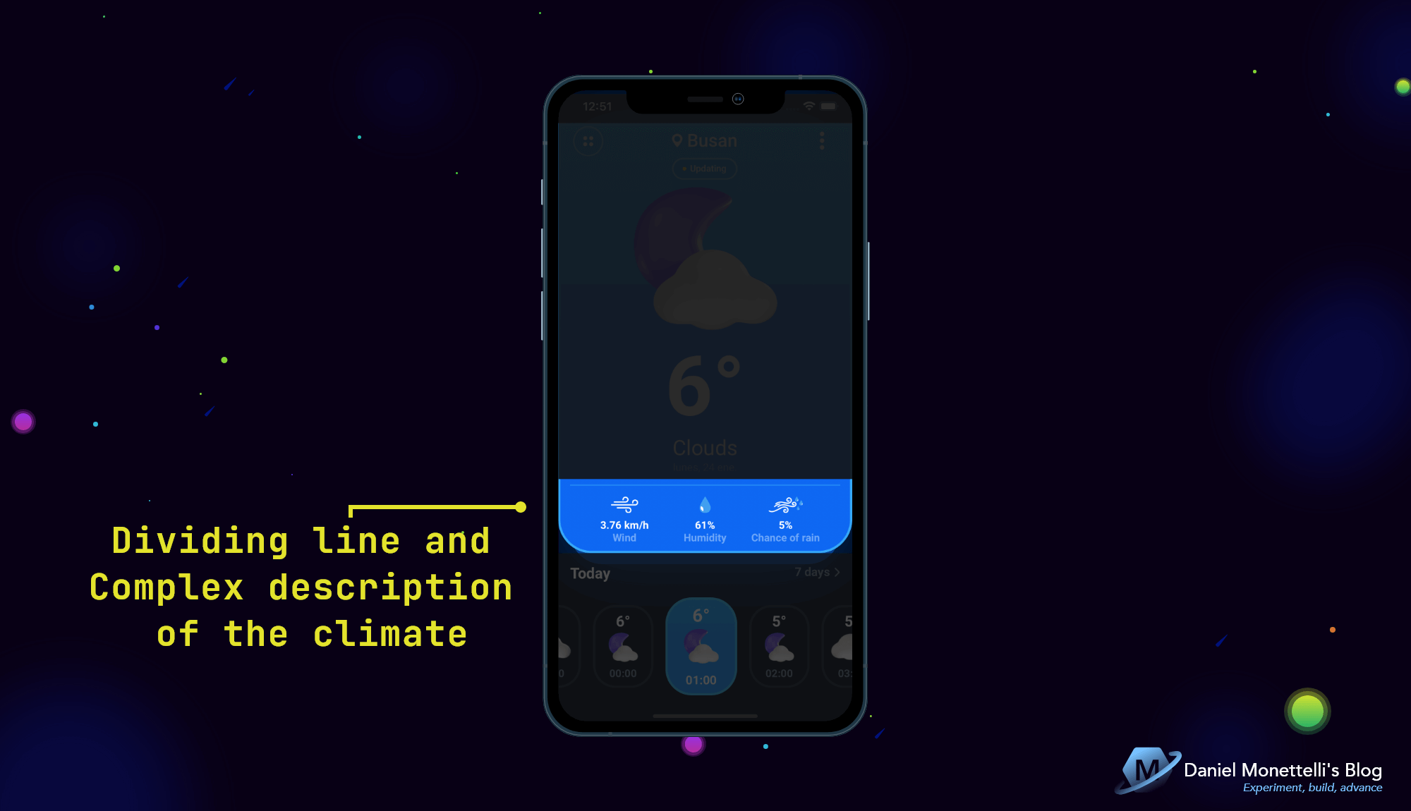 Dividing line and complex description of the climate
This region contains a dividing line followed by three horizontally separated objects that indicate wind, humidity, and chance of rain.
1
2
3
4
5
6
7
8
9
10
11
12
13
14
15
16
17
18
19
20
21
22
23
24
25
26
27
28
29
30
31
32
33
34
35
36
37
38
39
40
41
42
43
44
45
46
47
48
49
50
51
52
53
54
55
56
57
58
59
60
61
62
63
64
65
66
67
68
69
70
71
72
73
74
75
76
<!--#region Dividing line-->
<BoxView
    x:Name="dividingLine"
    BackgroundColor="{StaticResource co_elev}"
    Style="{StaticResource vsm_orientation_dividingLine}" />
<!--#endregion-->

<!--#region Complex description of the climate-->
<Grid
    x:Name="gridComplexDescriptionClimate"
    Padding="4,0,4,12"
    ColumnDefinitions="*, Auto, *"
    ColumnSpacing="10"
    Style="{StaticResource vsm_orientation_gridComplexDescriptionClimate}">

    <StackLayout Grid.Column="0">

        <Image Source="{StaticResource icon_wind_outline}" />

        <Label
            Margin="0,8,0,0"
            HorizontalTextAlignment="Center"
            Style="{OnIdiom Phone={OnPlatform Default={StaticResource TxtSubtitle2_2}},
                            Tablet={OnPlatform Default={StaticResource TxtHeadline6_2}}}"
            Text="{Binding MyHourly.Wind_speed, StringFormat='{0} km/h'}" />

        <Label
            HorizontalTextAlignment="Center"
            Style="{OnIdiom Phone={OnPlatform Default={StaticResource TxtBody2_1}},
                            Tablet={OnPlatform Default={StaticResource TxtSubtitle1_4}}}"
            Text="Wind" />
    </StackLayout>

    <StackLayout Grid.Column="1">

        <Image
            HeightRequest="22"
            Source="svg_humidity_solid.png"
            WidthRequest="22" />

        <Label
            Margin="0,8,0,0"
            HorizontalTextAlignment="Center"
            Style="{OnIdiom Phone={OnPlatform Default={StaticResource TxtSubtitle2_2}},
                            Tablet={OnPlatform Default={StaticResource TxtHeadline6_2}}}"
            Text="{Binding MyHourly.Humidity, StringFormat='{0}%'}" />

        <Label
            HorizontalTextAlignment="Center"
            Style="{OnIdiom Phone={OnPlatform Default={StaticResource TxtBody2_1}},
                            Tablet={OnPlatform Default={StaticResource TxtSubtitle1_4}}}"
            Text="Humidity" />
    </StackLayout>

    <StackLayout Grid.Column="2">

        <Image
            HeightRequest="22"
            Source="svg_chance_of_rain_mix.svg"
            WidthRequest="22" />

        <Label
            Margin="0,8,0,0"
            HorizontalTextAlignment="Center"
            Style="{OnIdiom Phone={OnPlatform Default={StaticResource TxtSubtitle2_2}},
                            Tablet={OnPlatform Default={StaticResource TxtHeadline6_2}}}"
            Text="{Binding MyHourly.Wind_gust, StringFormat='{0}%', Converter={StaticResource DoubleToIntConverter}}" />

        <Label
            HorizontalTextAlignment="Center"
            Style="{OnIdiom Phone={OnPlatform Default={StaticResource TxtBody2_1}},
                            Tablet={OnPlatform Default={StaticResource TxtSubtitle1_4}}}"
            Text="Chance of rain" />
    </StackLayout>
</Grid>
<!--#endregion-->
Today and 7 days titles
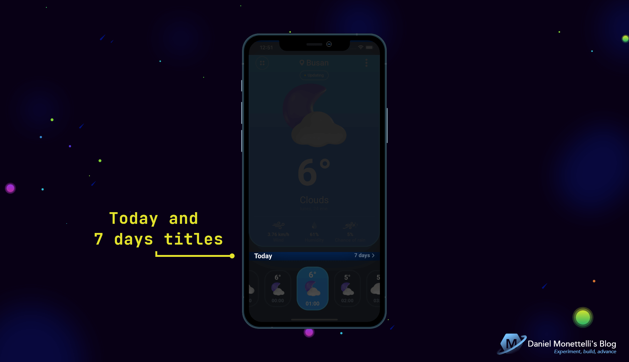 Today and 7 days titles
This region contains two horizontally separated labels.
1
2
3
4
5
6
7
8
9
10
11
12
13
14
15
16
17
18
19
20
21
22
23
24
25
26
27
28
29
30
31
32
33
<!--#region Today and 7 days titles-->
<StackLayout
    x:Name="stackTodayAnd7Days"
    Orientation="Horizontal"
    Style="{StaticResource vsm_orientation_stackTodayAnd7Days}">
    <Label
        Style="{OnIdiom Phone={OnPlatform Default={StaticResource TxtHeadline6_2}},
                        Tablet={OnPlatform Default={StaticResource TxtHeadline5_2}}}"
        Text="Today"
        TranslationY="2"
        VerticalTextAlignment="Center" />
    <StackLayout
        Padding="16,0"
        xct:TouchEffect.AnimationDuration="300"
        xct:TouchEffect.NativeAnimation="True"
        xct:TouchEffect.PressedBackgroundColor="#C8E6DB"
        HorizontalOptions="EndAndExpand"
        Orientation="Horizontal"
        Spacing="6">
        <StackLayout.GestureRecognizers>
            <TapGestureRecognizer Command="{Binding BindingContext.DailyForecast7DaysCommand, Source={x:Reference parentPage}}" />
        </StackLayout.GestureRecognizers>
        <Label
            Style="{OnIdiom Phone={OnPlatform Default={StaticResource TxtSubtitle1_1}},
                            Tablet={OnPlatform Default={StaticResource TxtTitle1_2}}}"
            Text="7 days"
            VerticalTextAlignment="Center" />
        <Image
            Source="{StaticResource icon_arrow_forward_outline}"
            TranslationY="1" />
    </StackLayout>
</StackLayout>
<!--#endregion-->
Forecast 24 hours a day Collection
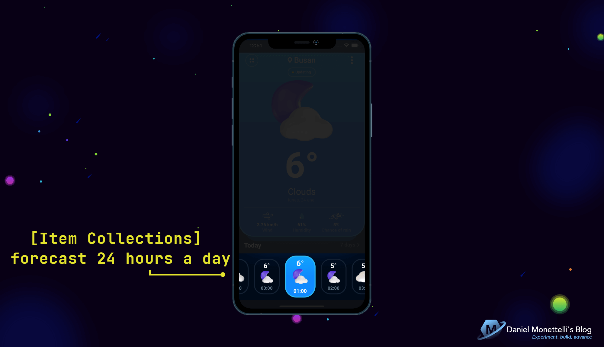 Forecast 24 hours a day Collection
This region contains the “24 hour forecast” collection.
1
2
3
4
5
6
7
8
9
10
11
12
13
14
15
16
17
18
19
20
21
22
23
24
25
26
27
28
29
30
31
32
33
34
35
36
37
38
39
40
41
42
43
44
45
46
47
48
49
50
51
52
53
54
55
56
57
58
59
60
61
62
63
64
65
<!--#region [Item Collections] forecast 24 hours a day-->
<ScrollView
    x:Name="scrollForecast24Hours"
    Padding="16,0"
    Orientation="Horizontal"
    Style="{StaticResource vsm_orientation_scrollForecast24Hours}">

    <FlexLayout
        Padding="{OnIdiom Phone={OnPlatform Default='-8,-2,-8,0'},
                          Tablet={OnPlatform Default='-12,-4,-12,0'}}"
        AlignItems="Center"
        BindableLayout.ItemsSource="{Binding Hourlies}"
        Direction="Column"
        JustifyContent="Center"
        Wrap="Wrap">
        <BindableLayout.ItemTemplate>
            <DataTemplate x:DataType="models:Hourly">

                <yummy:PancakeView
                    Margin="{OnIdiom Phone={OnPlatform Default='8,2,8,0'},
                                     Tablet={OnPlatform Default='12,4,12,0'}}"
                    Padding="0,10"
                    BackgroundGradientEndPoint="0,1"
                    BackgroundGradientStartPoint="0,0"
                    Style="{StaticResource vsm_surfaceHourly}">

                    <yummy:PancakeView.GestureRecognizers>
                        <TapGestureRecognizer
                            Command="{Binding BindingContext.SelectedHourlyCommand, Source={x:Reference parentPage}}"
                            CommandParameter="{Binding .}"
                            Tapped="SelectedWeather_Tapped" />
                    </yummy:PancakeView.GestureRecognizers>

                    <StackLayout Spacing="2">

                        <!--#region Temperature in degrees celsius-->
                        <Label
                            x:Name="labelTemperature"
                            HorizontalTextAlignment="Center"
                            Style="{StaticResource vsm_labelTemperature}"
                            Text="{Binding Temp, StringFormat='{0}°', Converter={StaticResource DoubleToIntConverter}}" />
                        <!--#endregion-->

                        <!--#region Small weather icon-->
                        <ffimageloading:CachedImage
                            x:Name="imageSmallWeather"
                            Source="{Binding Weather[0].Icon, Converter={StaticResource CustomImageUrlScalingConverter}, ConverterParameter=2}"
                            Style="{StaticResource vsm_imageSmallWeather}" />
                        <!--#endregion-->

                        <!--#region Time per hour-->
                        <Label
                            x:Name="labelHour"
                            HorizontalTextAlignment="Center"
                            Style="{StaticResource vsm_labelHour}"
                            Text="{Binding Dt, Converter={StaticResource UnixTimeToDateTimeConverter}, ConverterParameter=HH:mm}"
                            VerticalOptions="EndAndExpand" />
                        <!--#endregion-->
                    </StackLayout>
                </yummy:PancakeView>
            </DataTemplate>
        </BindableLayout.ItemTemplate>
    </FlexLayout>
</ScrollView>
<!--#endregion-->
HomeDetailPage Structure
The HomeDetailPage interface is composed in the first instance by a GridLayout, inside it houses two PancakeViews in charge of giving it that three-dimensional appearance and whose objective is to outline its respective content.
1
2
3
4
5
6
7
8
9
10
11
12
13
14
15
16
17
18
19
20
21
22
23
24
25
26
27
28
29
30
31
32
33
34
35
36
37
38
39
40
41
42
43
44
45
46
47
48
49
50
51
52
53
54
55
56
57
58
<ContentPage>

    <ContentPage.Resources>
        <ResourceDictionary Source="Styles.xaml" />
        <ResourceDictionary Source="Orientations/HomeDetailPageOrientation.xaml" />
    </ContentPage.Resources>

    <ContentPage.Content>
        <!--#region Grid Parent-->
        <Grid
            x:Name="gridParent"
            Style="{StaticResource vsm_orientation_gridParent}">

            <!--#region Top layer lower 1-->
            <yummy:PancakeView
                x:Name="topLayerLower1"
                BackgroundColor="{StaticResource col_thirt}"
                CornerRadius="0,0,43,43"
                Shadow="{yummy:ShadowMarkup Color={StaticResource col_thirt},
                                            Opacity=0.93,
                                            BlurRadius=45}"
                Style="{StaticResource vsm_orientation_topLayerLower1}" />
            <!--#endregion-->

            <!--#region Top layer higher 2-->
            <yummy:PancakeView
                x:Name="topLayerHigher2"
                BackgroundGradientEndPoint="0,1"
                BackgroundGradientStartPoint="0,0"
                Border="{yummy:BorderMarkup Color={StaticResource col_twel},
                                            Thickness=3}"
                CornerRadius="0,0,45,45"
                Style="{StaticResource vsm_orientation_topLayerHigher2}">
                <yummy:PancakeView.BackgroundGradientStops>
                    <yummy:GradientStopCollection>
                        <yummy:GradientStop
                            Offset="0"
                            Color="{StaticResource col_prim}" />
                        <yummy:GradientStop
                            Offset="0.5"
                            Color="{StaticResource col_sec}" />
                    </yummy:GradientStopCollection>
                </yummy:PancakeView.BackgroundGradientStops>

                <Grid
                    Padding="16,0"
                    ColumnDefinitions="48, *, 48"
                    RowDefinitions="48, 24, *, 14, 2, 14, Auto">

                    <!-- Respective content... -->

                </Grid>
            </yummy:PancakeView>
            <!--#endregion-->
        </Grid>
        <!--#endregion-->
    </ContentPage.Content>
</ContentPage>
Top Icons in HomeDetailPage
 Top icons in HomeDetailPage
This region contains three icons and a label.
1
2
3
4
5
6
7
8
9
10
11
12
13
14
15
16
17
18
19
20
21
22
23
24
25
26
27
28
29
30
31
32
33
34
35
36
37
38
39
40
41
42
43
44
45
46
47
48
49
50
<!--#region Top icons-->
<yummy:PancakeView
    Grid.Row="0"
    Grid.Column="0"
    xct:TouchEffect.AnimationDuration="300"
    xct:TouchEffect.NativeAnimation="True"
    xct:TouchEffect.PressedBackgroundColor="#171D59"
    CornerRadius="8,8,8,8">
    <yummy:PancakeView.GestureRecognizers>
        <TapGestureRecognizer Command="{Binding GoBackCommand}" />
    </yummy:PancakeView.GestureRecognizers>

    <Image
        HeightRequest="40"
        HorizontalOptions="Center"
        Source="svg_circle_arrow_backward_outline.png"
        VerticalOptions="CenterAndExpand"
        WidthRequest="40" />
</yummy:PancakeView>

<StackLayout
    Grid.Row="0"
    Grid.Column="1"
    HorizontalOptions="CenterAndExpand"
    Orientation="Horizontal"
    Spacing="6"
    VerticalOptions="CenterAndExpand">

    <Image Source="{OnIdiom Phone={OnPlatform Default={StaticResource icon_calendar_outline_phone}}, Tablet={OnPlatform Default={StaticResource icon_calendar_outline_tablet}}}" />

    <Label
        Style="{OnIdiom Phone={OnPlatform Default={StaticResource TxtHeadline5_1}},
                        Tablet={OnPlatform Default={StaticResource TxtHeadline4_3}}}"
        Text="7 days" />
</StackLayout>

<yummy:PancakeView
    Grid.Row="0"
    Grid.Column="2"
    xct:TouchEffect.AnimationDuration="300"
    xct:TouchEffect.NativeAnimation="True"
    xct:TouchEffect.PressedBackgroundColor="#171D59"
    CornerRadius="8,8,8,8">

    <Image
        HorizontalOptions="Center"
        Source="{StaticResource icon_picker_solid}"
        VerticalOptions="CenterAndExpand" />
</yummy:PancakeView>
<!--#endregion-->
Tomorrow is weather
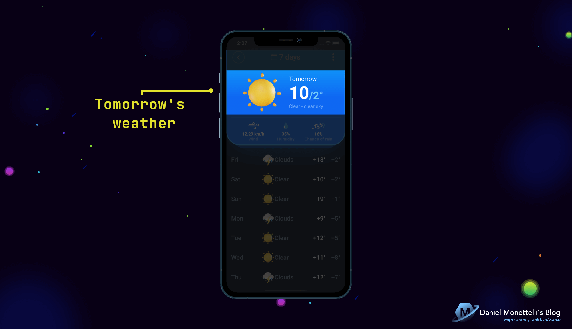 Tomorrow is weather
This region contains the weather image, followed by three vertically separated labels that describe tomorrow’s temperature and weather type.
1
2
3
4
5
6
7
8
9
10
11
12
13
14
15
16
17
18
19
20
21
22
23
24
25
26
27
28
29
30
31
32
33
34
35
36
37
38
39
40
41
42
43
44
45
46
47
48
49
50
51
<!--#region Tomorrow's weather-->
<Grid
    Grid.Row="2"
    Grid.ColumnSpan="3"
    ColumnDefinitions="50*, 50*"
    ColumnSpacing="20">

    <ffimageloading:CachedImage
        x:Name="imageTomorrowWeather"
        Grid.Column="0"
        Source="{Binding MyDaily.Weather[0].Icon, Converter={StaticResource CustomImageUrlScalingConverter}, ConverterParameter=10}"
        Style="{StaticResource vsm_orientation_imageTomorrowWeather}" />

    <StackLayout
        Grid.Column="1"
        VerticalOptions="Center">

        <Label
            Style="{OnIdiom Phone={OnPlatform Default={StaticResource TxtHeadline6_1}},
                            Tablet={OnPlatform Default={StaticResource TxtHeadline3_1}}}"
            Text="Tomorrow" />

        <Label>
            <Label.FormattedText>
                <FormattedString>
                    <Span
                        Style="{OnIdiom Phone={OnPlatform Default={StaticResource Span_TxtUnknown1_2}},
                                        Tablet={OnPlatform Default={StaticResource Span_TxtUnknown1_6}}}"
                        Text="{Binding MyDaily.Temp.Max, Converter={StaticResource DoubleToIntConverter}}" />
                    <Span
                        Style="{OnIdiom Phone={OnPlatform Default={StaticResource Span_TxtHeadline4_1}},
                                        Tablet={OnPlatform Default={StaticResource Span_TxtHeadline2_1}}}"
                        Text="{Binding MyDaily.Temp.Min, Converter={StaticResource DoubleToIntConverter}, StringFormat='/{0}°'}" />
                </FormattedString>
            </Label.FormattedText>
        </Label>

        <Label
            LineBreakMode="CharacterWrap"
            Style="{OnIdiom Phone={OnPlatform Default={StaticResource TxtSubtitle1_3}},
                            Tablet={OnPlatform Default={StaticResource TxtHeadline5_4}}}">
            <Label.Text>
                <MultiBinding StringFormat="{}{0} - {1}">
                    <Binding Path="MyDaily.Weather[0].Main" />
                    <Binding Path="MyDaily.Weather[0].Description" />
                </MultiBinding>
            </Label.Text>
        </Label>
    </StackLayout>
</Grid>
<!--#endregion-->
Dividing line and complex description of the climate in HomeDetailPage
 Dividing line and complex description of the climate
This region contains a dividing line followed by three objects separated horizontally and indicating wind, humidity and chance of rain.
1
2
3
4
5
6
7
8
9
10
11
12
13
14
15
16
17
18
19
20
21
22
23
24
25
26
27
28
29
30
31
32
33
34
35
36
37
38
39
40
41
42
43
44
45
46
47
48
49
50
51
52
53
54
55
56
57
58
59
60
61
62
63
64
65
66
67
68
69
<!--#region Complex description of the climate-->
<Grid
    Grid.Row="6"
    Grid.ColumnSpan="3"
    Padding="4,0,4,12"
    ColumnDefinitions="*, Auto, *"
    ColumnSpacing="10">

    <StackLayout Grid.Column="0">

        <Image Source="{StaticResource icon_wind_outline}" />

        <Label
            Margin="0,8,0,0"
            HorizontalTextAlignment="Center"
            Style="{OnIdiom Phone={OnPlatform Default={StaticResource TxtSubtitle2_2}},
                            Tablet={OnPlatform Default={StaticResource TxtHeadline6_2}}}"
            Text="{Binding MyDaily.Wind_speed, StringFormat='{0} km/h'}" />

        <Label
            HorizontalTextAlignment="Center"
            Style="{OnIdiom Phone={OnPlatform Default={StaticResource TxtBody2_1}},
                            Tablet={OnPlatform Default={StaticResource TxtSubtitle1_4}}}"
            Text="Wind" />
    </StackLayout>

    <StackLayout Grid.Column="1">

        <Image
            HeightRequest="22"
            Source="svg_humidity_solid.png"
            WidthRequest="22" />

        <Label
            Margin="0,8,0,0"
            HorizontalTextAlignment="Center"
            Style="{OnIdiom Phone={OnPlatform Default={StaticResource TxtSubtitle2_2}},
                            Tablet={OnPlatform Default={StaticResource TxtHeadline6_2}}}"
            Text="{Binding MyDaily.Humidity, StringFormat='{0}%'}" />

        <Label
            HorizontalTextAlignment="Center"
            Style="{OnIdiom Phone={OnPlatform Default={StaticResource TxtBody2_1}},
                            Tablet={OnPlatform Default={StaticResource TxtSubtitle1_4}}}"
            Text="Humidity" />
    </StackLayout>

    <StackLayout Grid.Column="2">

        <Image
            HeightRequest="22"
            Source="svg_chance_of_rain_mix.png"
            WidthRequest="22" />

        <Label
            Margin="0,8,0,0"
            HorizontalTextAlignment="Center"
            Style="{OnIdiom Phone={OnPlatform Default={StaticResource TxtSubtitle2_2}},
                            Tablet={OnPlatform Default={StaticResource TxtHeadline6_2}}}"
            Text="{Binding MyDaily.Wind_gust, StringFormat='{0}%', Converter={StaticResource DoubleToIntConverter}}" />

        <Label
            HorizontalTextAlignment="Center"
            Style="{OnIdiom Phone={OnPlatform Default={StaticResource TxtBody2_1}},
                            Tablet={OnPlatform Default={StaticResource TxtSubtitle1_4}}}"
            Text="Chance of rain" />
    </StackLayout>
</Grid>
<!--#endregion-->
Weekly weather Collection
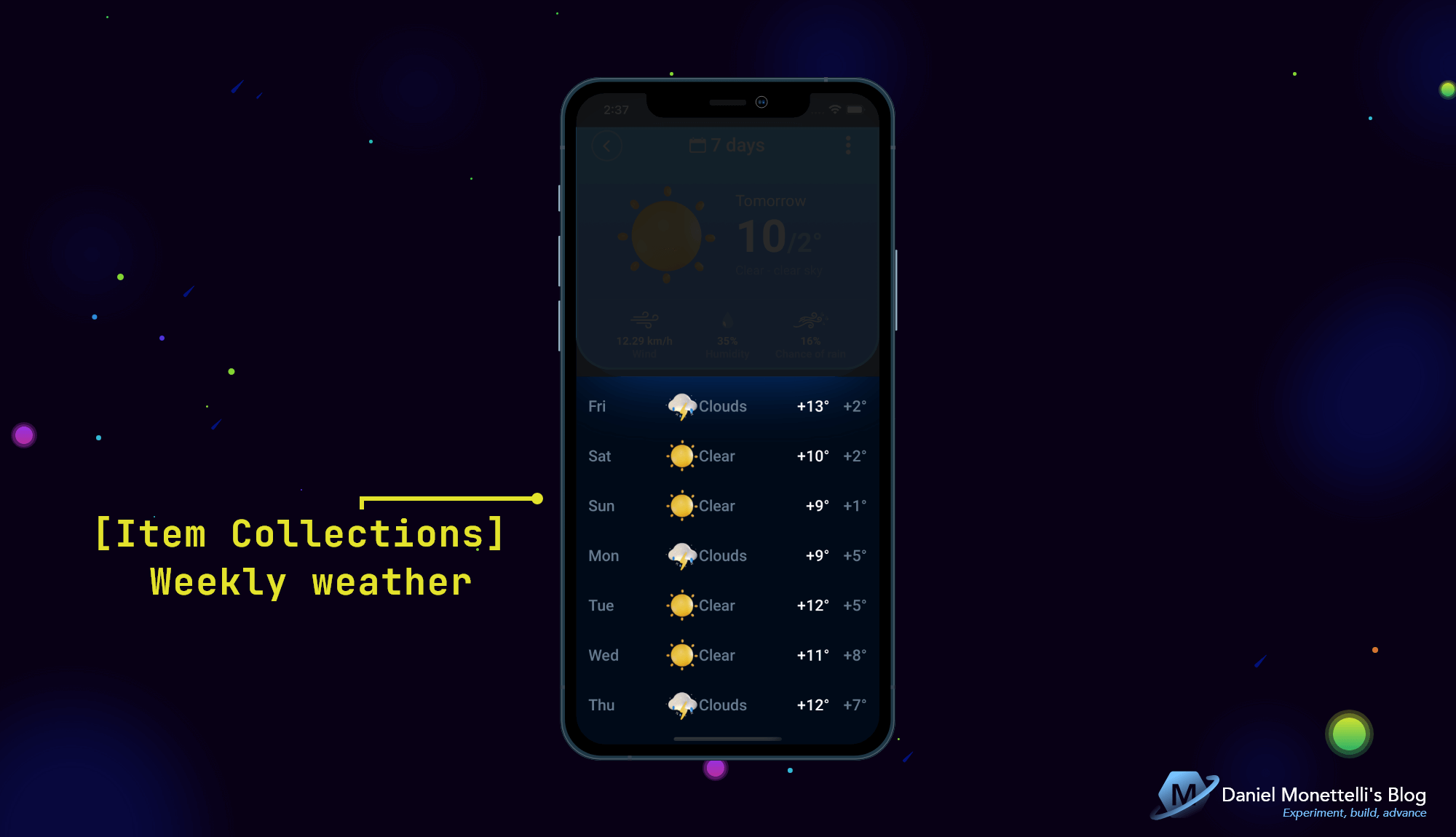 Weekly weather Collection
This region contains the “Weekly weather” collection.
1
2
3
4
5
6
7
8
9
10
11
12
13
14
15
16
17
18
19
20
21
22
23
24
25
26
27
28
29
30
31
32
33
34
35
36
37
38
39
40
41
42
43
44
45
46
47
48
49
50
51
52
53
54
55
56
57
58
59
60
61
62
63
64
65
66
67
68
69
70
<!--#region [Item Collections] Weekly weather-->
<ScrollView
    x:Name="scrollWeeklyWeather"
    Style="{StaticResource vsm_orientation_scrollWeeklyWeather}">
    <StackLayout
        BindableLayout.ItemsSource="{Binding Days}"
        Spacing="{OnIdiom Phone={OnPlatform Default=16},
                          Tablet={OnPlatform Default=24}}">
        <BindableLayout.ItemTemplate>
            <DataTemplate x:DataType="models:Daily">
                <Grid
                    xct:TouchEffect.AnimationDuration="300"
                    xct:TouchEffect.NativeAnimation="True"
                    xct:TouchEffect.PressedBackgroundColor="#030A15">
                    <Grid.RowDefinitions>
                        <!--  0  -->
                        <RowDefinition Height="{OnIdiom Phone={OnPlatform Default=48}, Tablet={OnPlatform Default=50}}" />
                    </Grid.RowDefinitions>
                    <Grid.ColumnDefinitions>
                        <!--  0  -->
                        <ColumnDefinition Width="{OnIdiom Phone={OnPlatform Default=48}, Tablet={OnPlatform Default=50}}" />
                        <!--  1  -->
                        <ColumnDefinition Width="50*" />
                        <!--  2  -->
                        <ColumnDefinition Width="{OnIdiom Phone={OnPlatform Default=44}, Tablet={OnPlatform Default=52}}" />
                        <!--  3  -->
                        <ColumnDefinition Width="{OnIdiom Phone={OnPlatform Default=70}, Tablet={OnPlatform Default=75}}" />
                        <!--  4  -->
                        <ColumnDefinition Width="50*" />
                        <!--  5  -->
                        <ColumnDefinition Width="{OnIdiom Phone={OnPlatform Default=48}, Tablet={OnPlatform Default=50}}" />
                        <!--  6  -->
                        <ColumnDefinition Width="{OnIdiom Phone={OnPlatform Default=48}, Tablet={OnPlatform Default=50}}" />
                    </Grid.ColumnDefinitions>
                    <Label
                        Grid.Column="0"
                        MaxLines="2"
                        Style="{OnIdiom Phone={OnPlatform Default={StaticResource TxtHeadline6_3}},
                                        Tablet={OnPlatform Default={StaticResource TxtHeadline5_5}}}"
                        Text="{Binding Dt, Converter={StaticResource DatetimeAndFirstCharactersMultiConverter}, ConverterParameter={StaticResource DatetimeAndFirstCharactersMultiConverterParams}}"
                        VerticalTextAlignment="Center" />
                    <ffimageloading:CachedImage
                        Grid.Column="2"
                        Source="{Binding Weather[0].Icon, Converter={StaticResource CustomImageUrlScalingConverter}, ConverterParameter=2}" />
                    <Label
                        Grid.Column="3"
                        Style="{OnIdiom Phone={OnPlatform Default={StaticResource TxtHeadline6_3}},
                                        Tablet={OnPlatform Default={StaticResource TxtHeadline5_5}}}"
                        Text="{Binding Weather[0].Main}"
                        VerticalTextAlignment="Center" />
                    <Label
                        Grid.Column="5"
                        HorizontalTextAlignment="End"
                        Style="{OnIdiom Phone={OnPlatform Default={StaticResource TxtHeadline6_4}},
                                        Tablet={OnPlatform Default={StaticResource TxtHeadline5_1}}}"
                        Text="{Binding Temp.Max, Converter={StaticResource NegativeAndPositiveIntMultiConverter}, StringFormat='{0}°'}"
                        VerticalTextAlignment="Center" />
                    <Label
                        Grid.Column="6"
                        HorizontalTextAlignment="End"
                        Style="{OnIdiom Phone={OnPlatform Default={StaticResource TxtHeadline6_3}},
                                        Tablet={OnPlatform Default={StaticResource TxtHeadline5_5}}}"
                        Text="{Binding Temp.Min, Converter={StaticResource NegativeAndPositiveIntMultiConverter}, StringFormat='{0}°'}"
                        VerticalTextAlignment="Center" />
                </Grid>
            </DataTemplate>
        </BindableLayout.ItemTemplate>
    </StackLayout>
</ScrollView>
<!--#endregion-->
Interface Harmony Tips
The harmony of interfaces is the mixture of the adapted with the responsive, due to the addition of proportions (*), mixing structure (OnPlatform nested in OnIdiom), converters, etc.
Xamarin.Forms and .NET MAUI offers its developers various options to create balanced interfaces focused on UX, let’s learn how to use them with the following tips:
HomePage in mode portrait
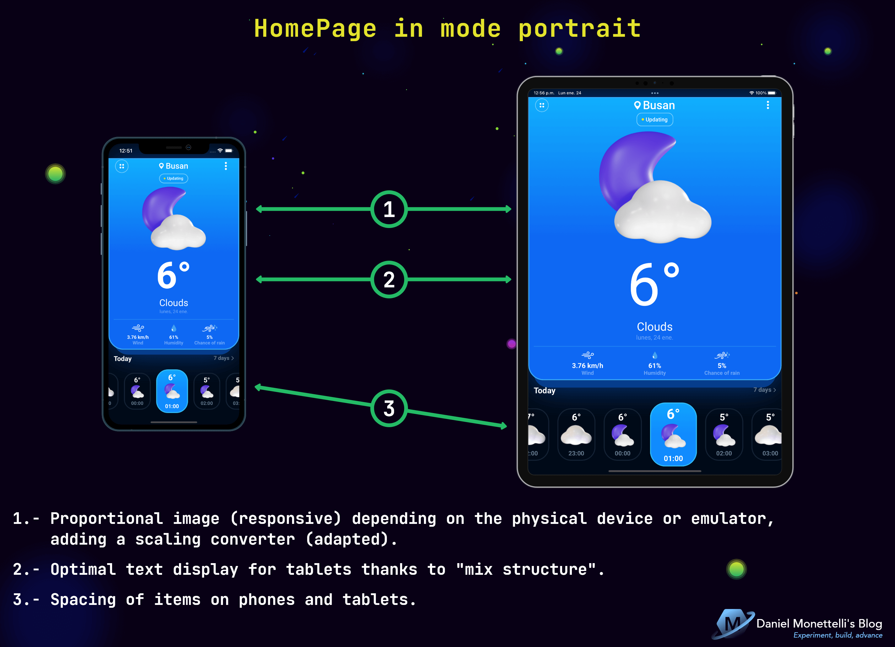 HomePage in mode portrait
1.- Proportional image (responsive) depending on the physical device or emulator, adding a scaling converter (adapted).
1
2
3
4
5
6
7
8
9
10
11
12
13
14
public class CustomImageUrlScalingConverter : IValueConverter
{

    public object Convert(object value, Type targetType, object parameter, CultureInfo culture)
    {
        // Image scale type in the parameter: 2(100x100approx), 4(200x200approx), 10(500x500approx)
        return "https://raw.githubusercontent.com/danielmonettelli/MyResources/main/OpenWeather_Icons_Redesign/" + value + "@" + parameter + "x.png";
    }

    public object ConvertBack(object value, Type targetType, object parameter, CultureInfo culture)
    {
        throw new NotImplementedException();
    }
}
2.- Optimal text display for tablets thanks to “mix structure”.
1
2
3
4
<Label
    Style="{OnIdiom Phone={OnPlatform Android={StaticResource TxtUnknown1_1},
                                      iOS={StaticResource TxtUnknown1_3}},
                    Tablet={OnPlatform Default={StaticResource TxtUnknown1_5}}}" />
3.- Spacing of items on phones and tablets.
1
2
3
4
<FlexLayout
    Padding="{OnIdiom Phone={OnPlatform Default='-8,-2,-8,0'},
                      Tablet={OnPlatform Default='-12,-4,-12,0'}}">
</FlexLayout>
HomePage in mode landscape
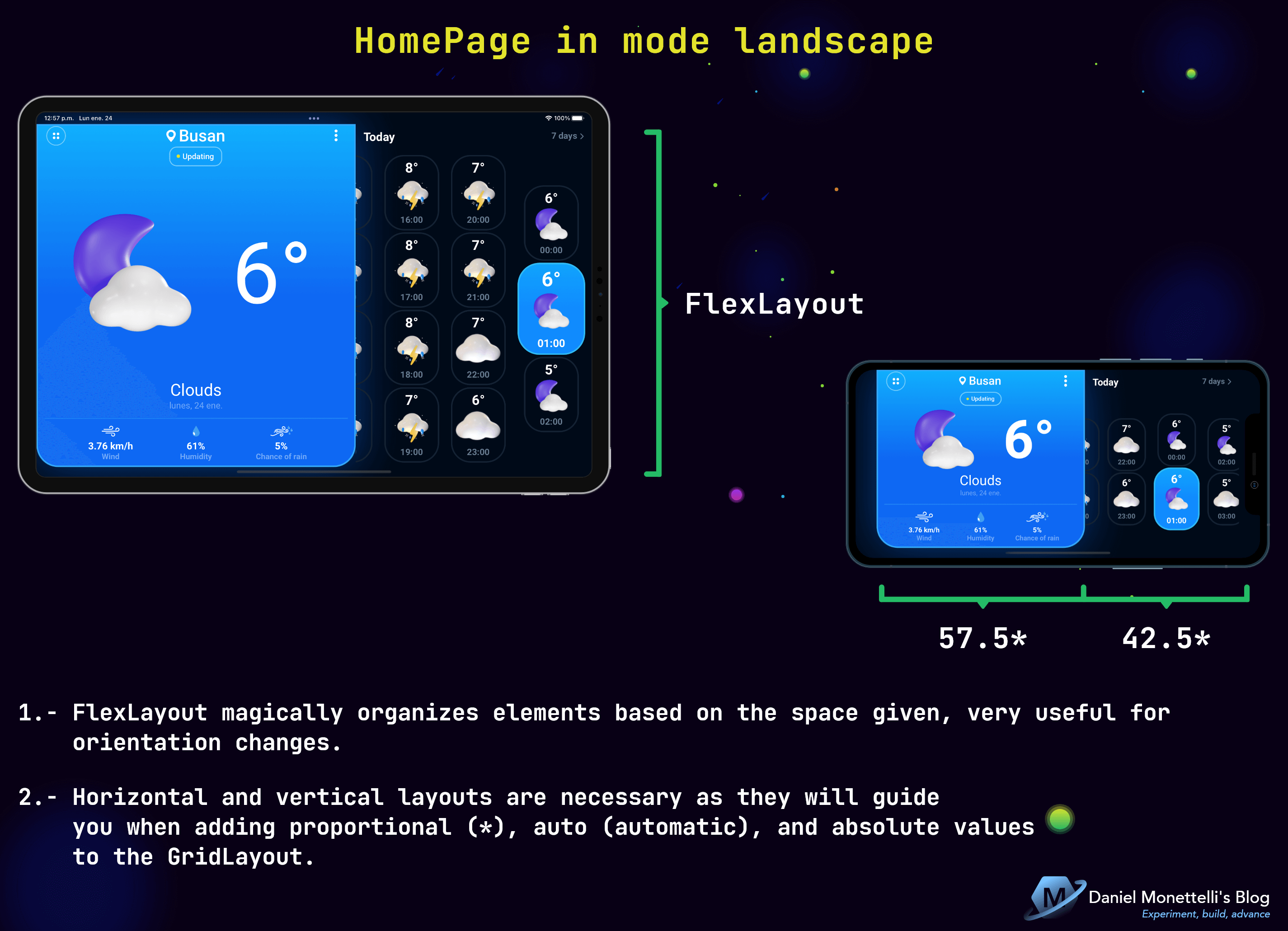 HomePage in mode landscape
1.- FlexLayout magically organizes elements based on the space given, very useful for orientation changes.
2.- Horizontal and vertical layouts are necessary as they will guide you when adding proportional (*), auto (automatic), and absolute values to the GridLayout.
HomeDetailPage in mode portrait
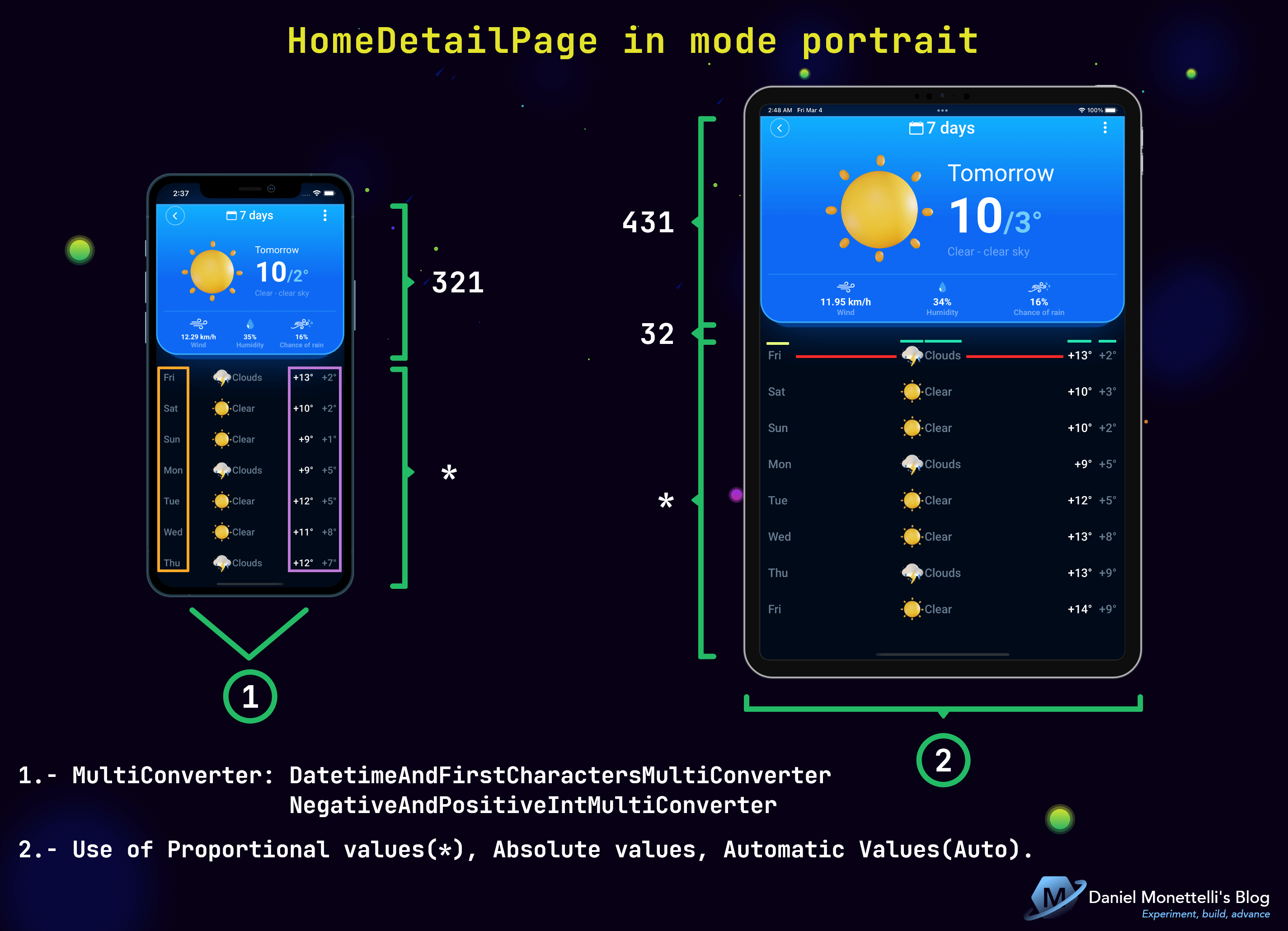 HomeDetailPage in mode portrait
1.- In many situations the converters are reused in the different interfaces of our application, and there are cases where it is necessary to pass 2 or more of them, therein lies the importance of the MultiConverter: The initial binding value is passed to the first converter and, depending on whatever these converters return, that value is then passed to the next converter.
1
2
3
4
5
6
7
8
9
10
11
12
13
14
15
16
17
18
19
20
21
22
23
24
25
26
<!--#region Converters-->
<converter:UnixTimeToDateTimeConverter x:Key="UnixTimeToDateTimeConverter" />
<converter:OpenWeatherImageUrlScalingConverter x:Key="OpenWeatherImageUrlScalingConverter" />
<converter:CustomImageUrlScalingConverter x:Key="CustomImageUrlScalingConverter" />
<xct:DoubleToIntConverter x:Key="DoubleToIntConverter" />

<xct:MultiConverter x:Key="DatetimeAndFirstCharactersMultiConverter">
    <converter:UnixTimeToDateTimeConverter />
    <converter:StringToFirstCharactersConverter />
</xct:MultiConverter>
<x:Array
    x:Key="DatetimeAndFirstCharactersMultiConverterParams"
    Type="{x:Type xct:MultiConverterParameter}">
    <xct:MultiConverterParameter
        ConverterType="{x:Type converter:UnixTimeToDateTimeConverter}"
        Value="dddd" />
    <xct:MultiConverterParameter
        ConverterType="{x:Type converter:StringToFirstCharactersConverter}"
        Value="3" />
</x:Array>

<xct:MultiConverter x:Key="NegativeAndPositiveIntMultiConverter">
    <xct:DoubleToIntConverter />
    <converter:NegativeAndPositiveNumberConverter />
</xct:MultiConverter>
<!--#endregion-->
2.- Responsible handling of the GridLayout in horizontal controls:
- Use ColumnDefinitions, depending on the number of controls.
- Use proportional values (*), in empty spaces to scale distances.
- Use absolute values, based on the maximum number of characters in the Label.
- Use Automatic (Auto) values, if changing characters does not affect the display.
HomeDetailPage in mode landscape
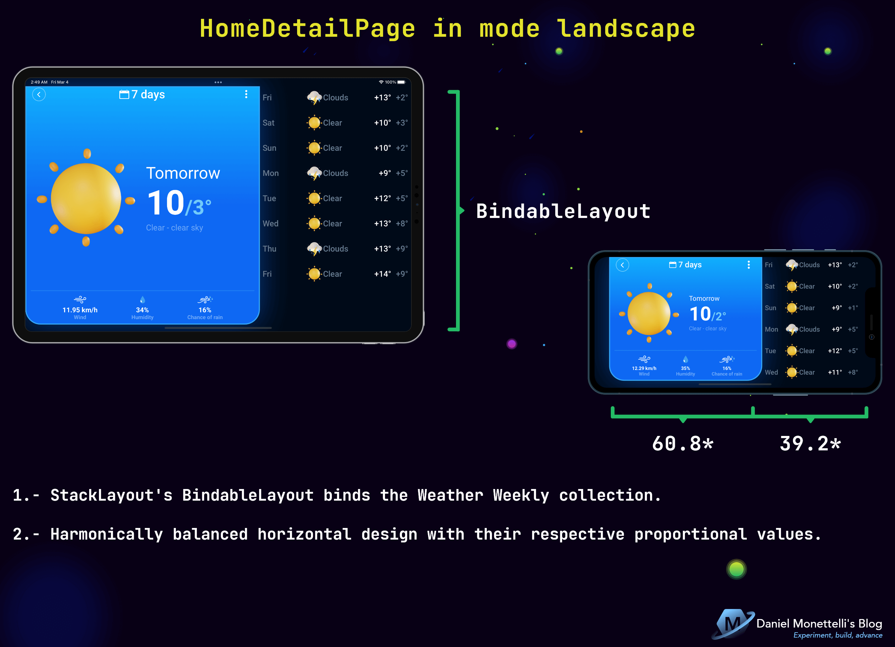 HomeDetailPage in mode landscape
1.- StackLayout’s BindableLayout binds the Weather Weekly collection.
2.- Harmonically balanced horizontal design with their respective proportional values.
Get the Code
All the code is open source, you can see it by clicking the following image:
Resources
- Getting started with Visual State Manager (VSM) in Xamarin Forms - written by Leomaris Reyes.
- Working with GridLayout in Xamarin Forms - written by Leomaris Reyes.
- Platform-Specific Values in XAML with OnPlatform in Xamarin.Forms - tutorial video made by Gerald Versluis.
- Xamarin.Forms 101: OnIdiom (Adjusting UI Based on Device Type) - tutorial video made by Maddy Montaquila.
- .NET Community Toolkit 8.0 - MVVM Goodness for .NET MAUI | .NET Conf: Focus on MAUI - tutorial video made by Sergio Pedri.
Conclusions
Xamarin.Forms and .NET MAUI offer a wide range of APIs to adapt our applications, let’s experiment with them to create effective UI/UX methods.
The tips that I mention in this post are based on my humble experience, use it at your own criterion.
Remember that you can give feedback and with the help of my repository draw your own conclusions, if you have any questions or constructive criticism write to me below this publication, thank you very much.