Xamarin.Forms UI/UX Challenges - Micuna Food - Part2
In this second part of the Challenge, the protagonist is the nuget package "Xamarin Community Toolkit", an all-in-one that provides abstractions that we commonly use.
This publication is part of the Second Xamarin Advent Calendar in Spanish organized by Dr. Luis Beltrán, and of the third C# Advent Calendar in Spanish organized by Ing. Benjamín Camacho, thank you very much for being part of these great initiatives.
Inspirational Design
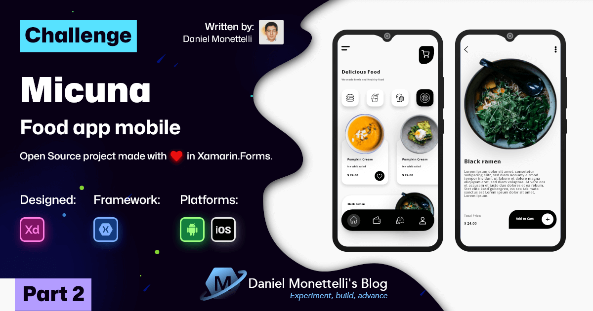
Continuing with the design of Ghulam Rasool, the following detail interface has two upper icons, one to go back and one to share, followed by the delicious image of the food, with its respective title and description, finally, the price of the food is accompanied by a button, which allows adding to the shopping cart, simple and clean at the same time.
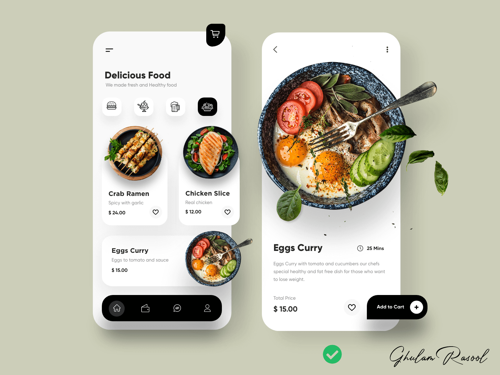 Design created by Ghulam Rasool - Experienced Product Designer
Navigating from HomePage to FoodDetailPage
 Navigating from HomePage to FoodDetailPage Design
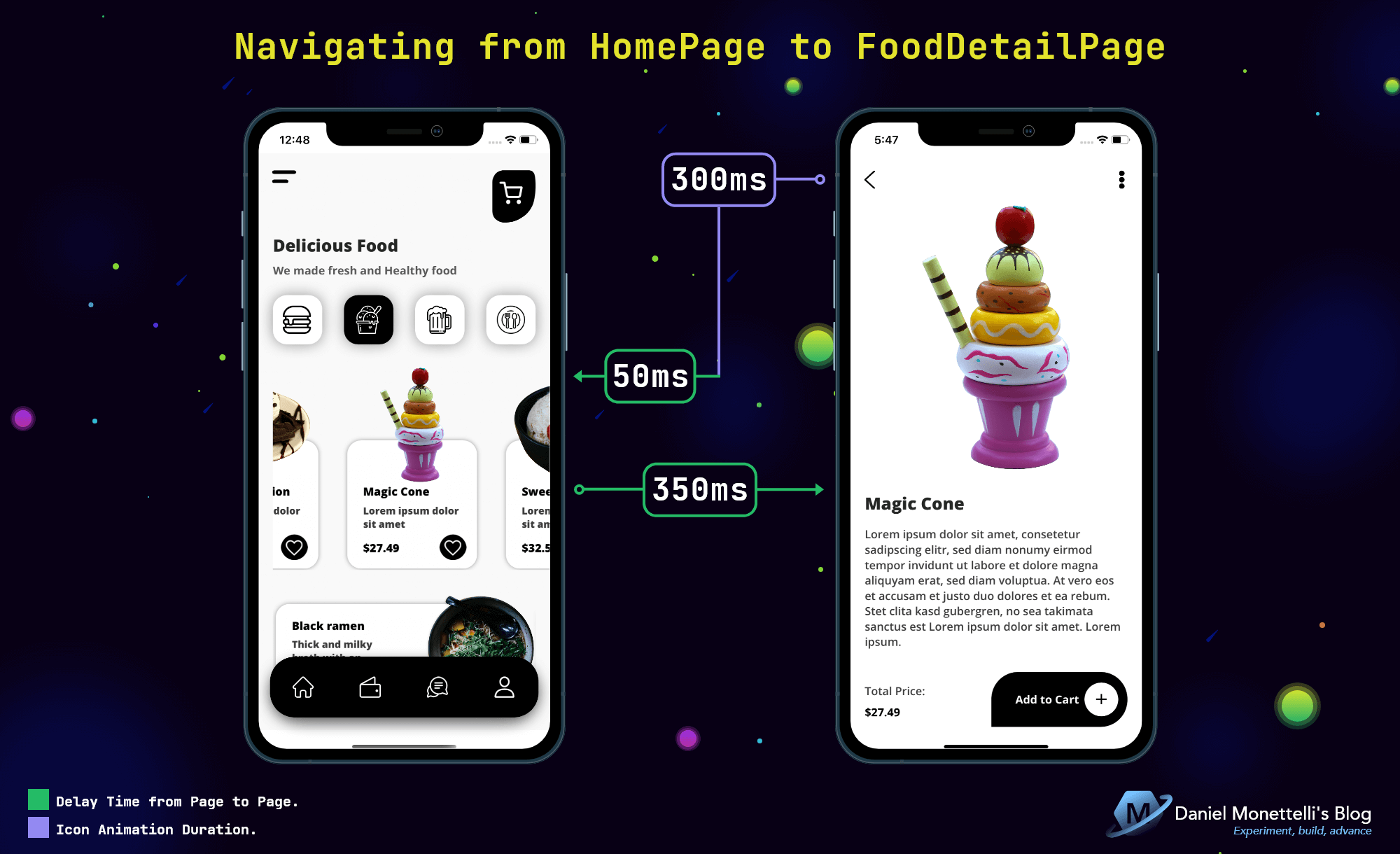
The navigation flow from page to page applies UX, when the user clicks on an item he has to observe what he did exactly, for this, a waiting time is necessary and then continue with the next page.
The following example(Code-Behind of HomePage) shows the CollectionView_SelectedItem event created from the SelectionChanged property of CollectionView, the selectedItem variable is made up of the event parameter, whose CurrentSelection property is responsible for finding the selected items, then an expression is added conditional(if) arguing that if there is a selection of an item, proceed with a Delay( ) of 350ms, and then go to the FoodDetailPage page, the item details are seen through the conversion “selectedItem as FoodsViewModel”, finally, said selection is canceled.
1
2
3
4
5
6
7
8
9
10
11
12
13
14
15
16
public partial class HomePage : ContentPage
{

    // ...

    private async void CollectionView_SelectedItem(object sender, SelectionChangedEventArgs e)
    {
        var selectedItem = e.CurrentSelection.FirstOrDefault();
        if (selectedItem != null)
        {
            await Task.Delay(350);
            await Navigation.PushAsync(new FoodDetailPage(selectedItem as FoodsViewModel));
        }
        collectionView_MicunaFood.SelectedItem = null;
    }
}
The Code-Behind of FoodDetailPage has a similar logic to the previous one, the ReturnPreviousPage_Tapped” event created from GestureRecognizers, is responsible for returning to the HomePage, this triggers a 300ms animation(for the icon, see in the XAML), then complete the 50ms wait to return to the initial page.
1
2
3
4
5
6
7
8
9
10
11
public partial class FoodDetailPage : ContentPage
{

    // ...

    private async void ReturnPreviousPage_Tapped(object sender, EventArgs e)
    {
        await Task.Delay(350);
        await Navigation.PopAsync(true);
    }
}
FoodDetailViewModel is in charge of structuring the details of FoodDetailPage, we can see that HomeViewModel( ) is initialized in the constructor, because the list is there, the selectedItem variable filters the Foods list, and through LINQ the selectedFoodsViewModel is paired with the model property, finally, the FoodsViewModel( ) is initialized by adding the result of the selectedItem.
1
2
3
4
5
6
7
8
9
10
11
public class FoodDetailViewModel : BaseViewModel
{
    private readonly HomeViewModel homeViewModel;
    public FoodsViewModel SelectedFood { get; set; }
    public FoodDetailViewModel(FoodsViewModel selectedFoodsViewModel)
    {
        homeViewModel = new HomeViewModel();
        var selectedItem = homeViewModel.Foods.Where(f => f.Name_Food.Equals(selectedFoodsViewModel.Name_Food)).FirstOrDefault();
        SelectedFood = new FoodsViewModel(selectedItem);
    }
}
Proportions in the Interface
Going deeper into the issue of proportions, it is important to divide the elements of an interface into colored regions, both for the rows and for the columns, to later obtain a global view of both, this helps to locate the elements in the XAML.
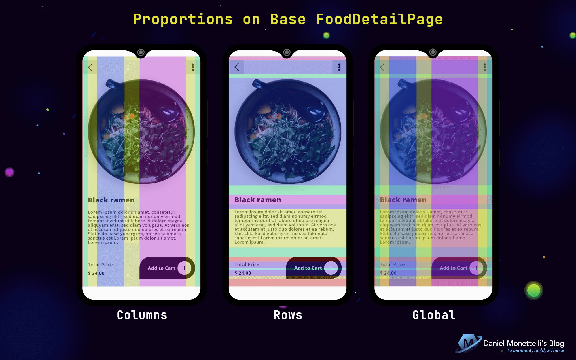 Proportions on Base FoodDetailPage
Proportions in FoodDetailPage.xaml
1
2
3
4
5
6
7
8
9
10
11
12
13
14
15
16
17
18
19
20
21
22
23
24
25
26
27
28
29
30
31
32
33
34
35
36
37
38
39
40
41
42
43
44
45
46
47
48
49
50
51
52
53
54
55
56
57
58
59
60
61
62
63
64
65
66
<ScrollView>
    <Grid>
        <Grid.RowDefinitions>
            <!--  0  -->
            <RowDefinition Height="13" />
            <!--  1  -->
            <RowDefinition Height="48" />
            <!--  2  -->
            <RowDefinition Height="13" />
            <!--  3  -->
            <RowDefinition>
            <!-- Mix Structure  -->
            </RowDefinition>
            <!--  4  -->
            <RowDefinition Height="32" />
            <!--  5  -->
            <RowDefinition Height="Auto" />
            <!--  6  -->
            <RowDefinition Height="16" />
            <!--  7  -->
            <RowDefinition Height="Auto" />
            <!--  8  -->
            <RowDefinition>
            <!-- Mix Structure  -->
            </RowDefinition>
            <!--  9  -->
            <RowDefinition Height="16" />
            <!--  10  -->
            <RowDefinition Height="Auto" />
            <!--  11  -->
            <RowDefinition Height="8" />
            <!--  12  -->
            <RowDefinition Height="Auto" />
            <!--  13  -->
            <RowDefinition Height="10" />
            <!--  14  -->
            <RowDefinition Height="25" />
        </Grid.RowDefinitions>
        <Grid.ColumnDefinitions>
            <!--  0  -->
            <ColumnDefinition Width="0.01*" />
            <!--  1  -->
            <ColumnDefinition Width="0.04*" />
            <!--  2  -->
            <ColumnDefinition Width="32" />
            <!--  3  -->
            <ColumnDefinition Width="0.23*" />
            <!--  4  -->
            <ColumnDefinition Width="0.126*" />
            <!--  5  -->
            <ColumnDefinition Width="161" />
            <!--  6  -->
            <ColumnDefinition Width="32" />
            <!--  7  -->
            <ColumnDefinition Width="0.04*" />
            <!--  8  -->
            <ColumnDefinition Width="0.01*" />
        </Grid.ColumnDefinitions>

        <!--  Top Icons  -->
        <!--  Image  -->
        <!--  Title and Description  -->
        <!--  Description and Price Value  -->
        <!--  Add to Cart Button  -->
    </Grid>
</ScrollView>
Top Icons
Complying with the Material Design parameters, the icons were standardized with a Touch Target Area of 48*48px, all thanks to TouchEffect, a super useful and important effect from Xamarin Community Toolkit.
1
2
3
4
5
6
7
8
9
10
11
12
13
14
15
16
17
18
19
20
21
22
23
24
25
26
27
<!--  Top Icons  -->
<StackLayout
    Grid.Row="1"
    Grid.Column="1"
    Grid.ColumnSpan="2"
    xct:TouchEffect.NativeAnimation="True"
    xct:TouchEffect.AnimationDuration="300">
    <StackLayout.GestureRecognizers>
        <TapGestureRecognizer Tapped="ReturnPreviousPage_Tapped" />
    </StackLayout.GestureRecognizers>
    <Image
        Source="{StaticResource icon_left_arrow_line}"
        HorizontalOptions="Center"
        VerticalOptions="CenterAndExpand" />
</StackLayout>

<StackLayout
    Grid.Row="1"
    Grid.Column="6"
    Grid.ColumnSpan="2"
    xct:TouchEffect.NativeAnimation="True"
    xct:TouchEffect.AnimationDuration="300">
    <Image
        Source="{StaticResource icon_share_solid}"
        HorizontalOptions="Center"
        VerticalOptions="CenterAndExpand" />
</StackLayout>
Proportional Image
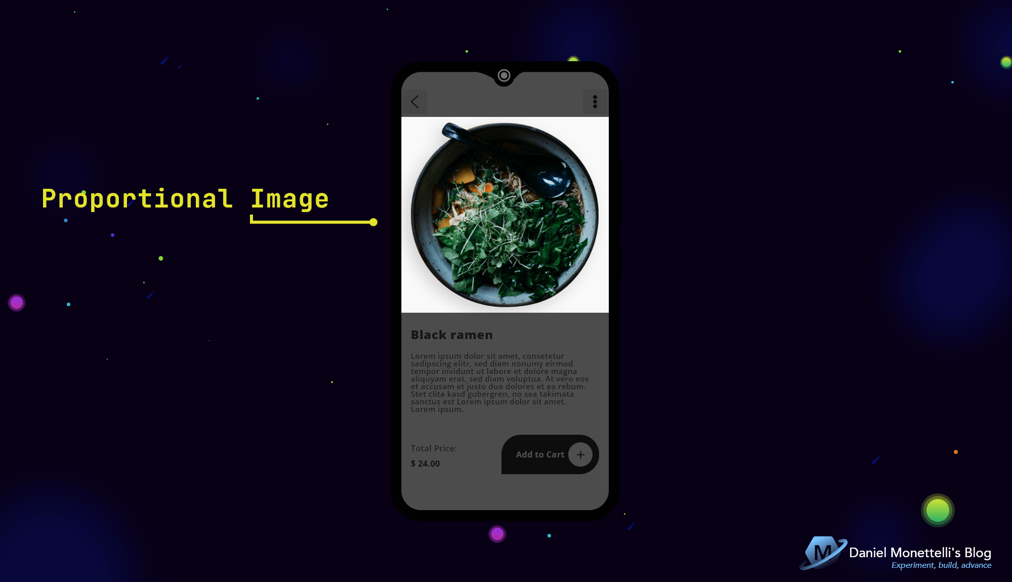
As for images, FFImageLoading is my ally to optimize them.
1
2
3
4
5
6
7
8
9
10
11
<!--  Image  -->
<ffimageloading:CachedImage
    Grid.Row="3"
    Grid.Column="2"
    Grid.ColumnSpan="5"
    CacheDuration="30"
    DownsampleToViewSize="True"
    FadeAnimationForCachedImages="True"
    FadeAnimationEnabled="True"
    FadeAnimationDuration="100"
    Source="{Binding SelectedFood.Image_Food}" />
Title and Description
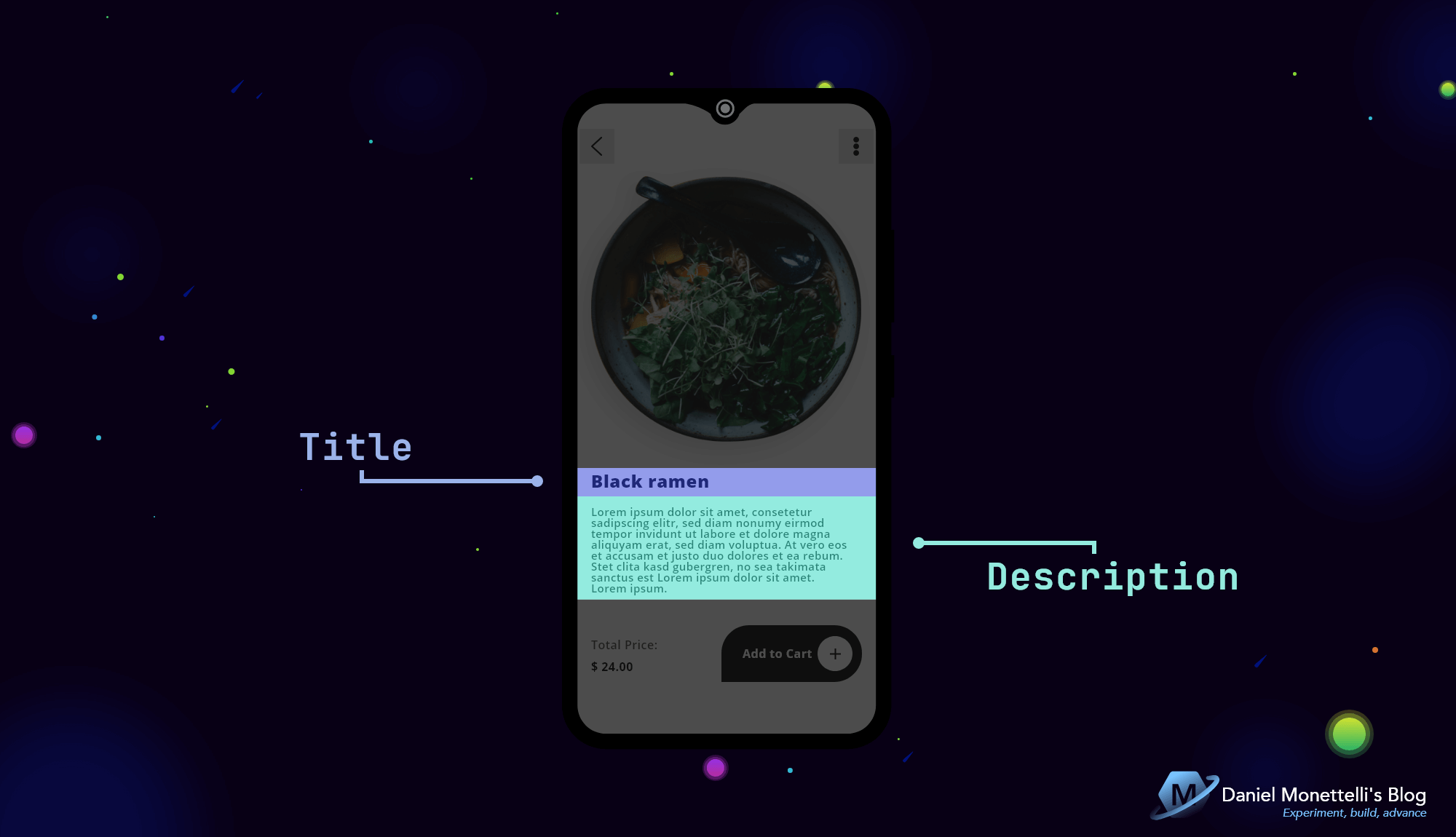
Title and Description located proportionally.
1
2
3
4
5
6
7
8
9
10
11
12
13
14
<!--  Title and Description  -->
<Label
    Grid.Row="5"
    Grid.Column="2"
    Grid.ColumnSpan="5"
    Text="{Binding SelectedFood.Name_Food}"
    Style="{StaticResource TxtHeadLine5_1}" />
<Label
    Grid.Row="7"
    Grid.Column="2"
    Grid.ColumnSpan="5"
    MaxLines="100"
    Text="{Binding SelectedFood.Long_Description_Food}"
    Style="{StaticResource TxtBody1_1}" />
Description and Price Value
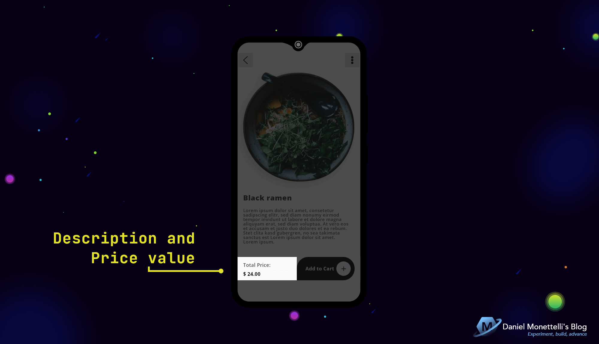 Description and Price Value Design
Description and Price Value located proportionally.
1
2
3
4
5
6
7
8
9
10
11
12
13
<!--  Description and Price Value  -->
<Label
    Grid.Row="10"
    Grid.Column="2"
    Grid.ColumnSpan="2"
    Text="Total Price:"
    Style="{StaticResource TxtBody1_1}" />
<Label
    Grid.Row="12"
    Grid.Column="2"
    Grid.ColumnSpan="2"
    Text="{Binding SelectedFood.Price_Food, StringFormat='{0:C2}'}"
    Style="{StaticResource TxtBody1_2}" />
Add to Cart Button
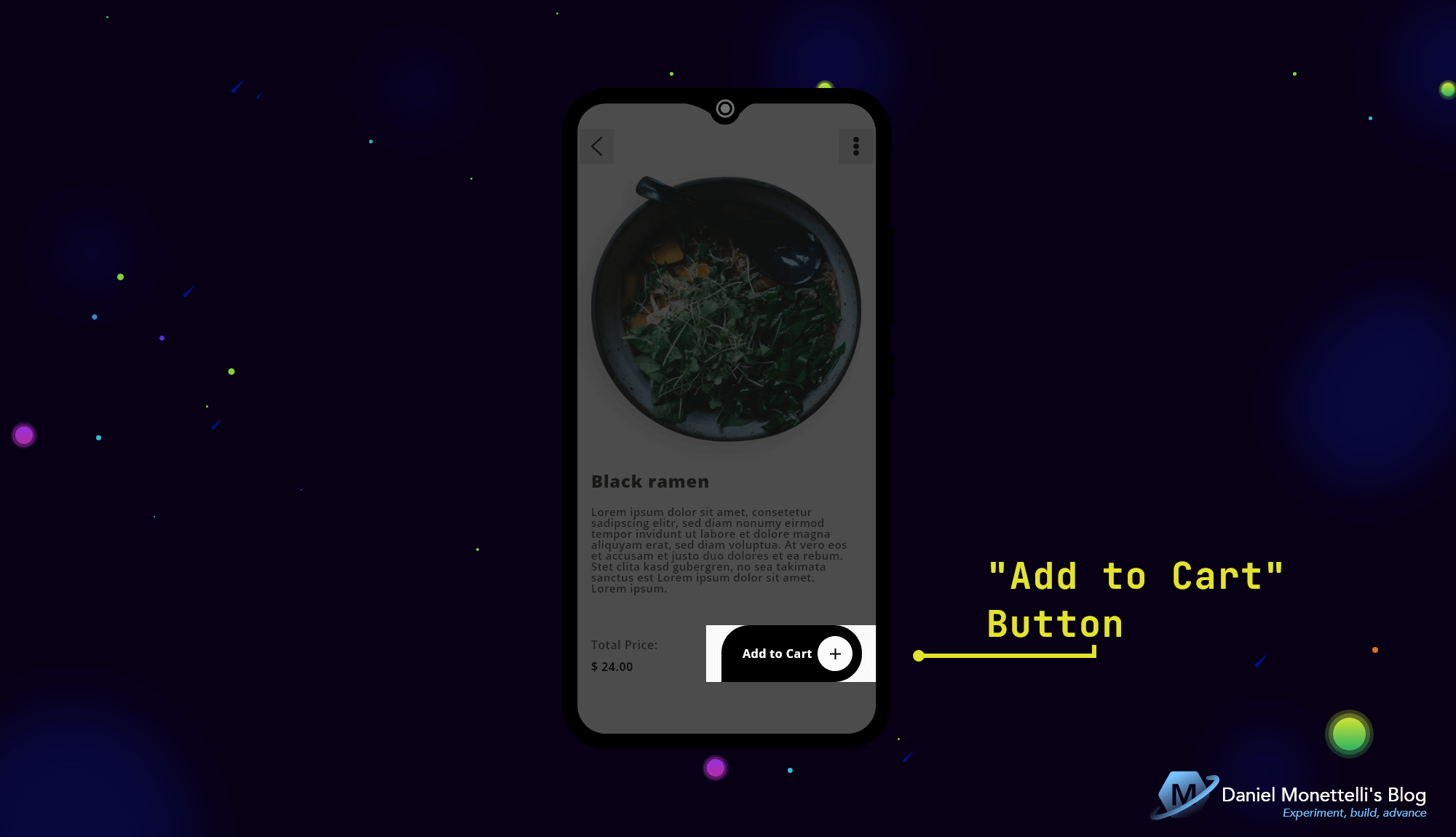
The Button is made with PancakeView, that custom shape was obtained with the “CornerRadius” property in 4 parameters, and with TouchEffect the essence that every Button should have was reinforced, the “add icon” was also encapsulated with PancakeView.
1
2
3
4
5
6
7
8
9
10
11
12
13
14
15
16
17
18
19
20
21
22
23
24
25
26
27
28
29
30
31
32
<!--  Add to Cart Button  -->
<yummy:PancakeView
    Grid.Row="9"
    Grid.RowSpan="5"
    Grid.Column="5"
    Grid.ColumnSpan="2"
    Padding="13,0"
    xct:TouchEffect.NativeAnimation="True"
    xct:TouchEffect.AnimationDuration="300"
    BackgroundColor="{DynamicResource colPrim}"
    CornerRadius="38,38,0,38">
    <StackLayout
        Orientation="Horizontal"
        VerticalOptions="CenterAndExpand"
        Spacing="7">
        <Label
            Text="Add to Cart"
            Style="{StaticResource TxtSubtitle1_3}"
            HorizontalOptions="EndAndExpand"
            VerticalOptions="Center" />
        <yummy:PancakeView
            BackgroundColor="{DynamicResource colQui}"
            HorizontalOptions="End"
            HeightRequest="48"
            WidthRequest="48"
            CornerRadius="24">
            <Image
                Source="{StaticResource icon_add_line}"
                VerticalOptions="CenterAndExpand" />
        </yummy:PancakeView>
    </StackLayout>
</yummy:PancakeView>
Good UX Practices in Harmonic Interfaces
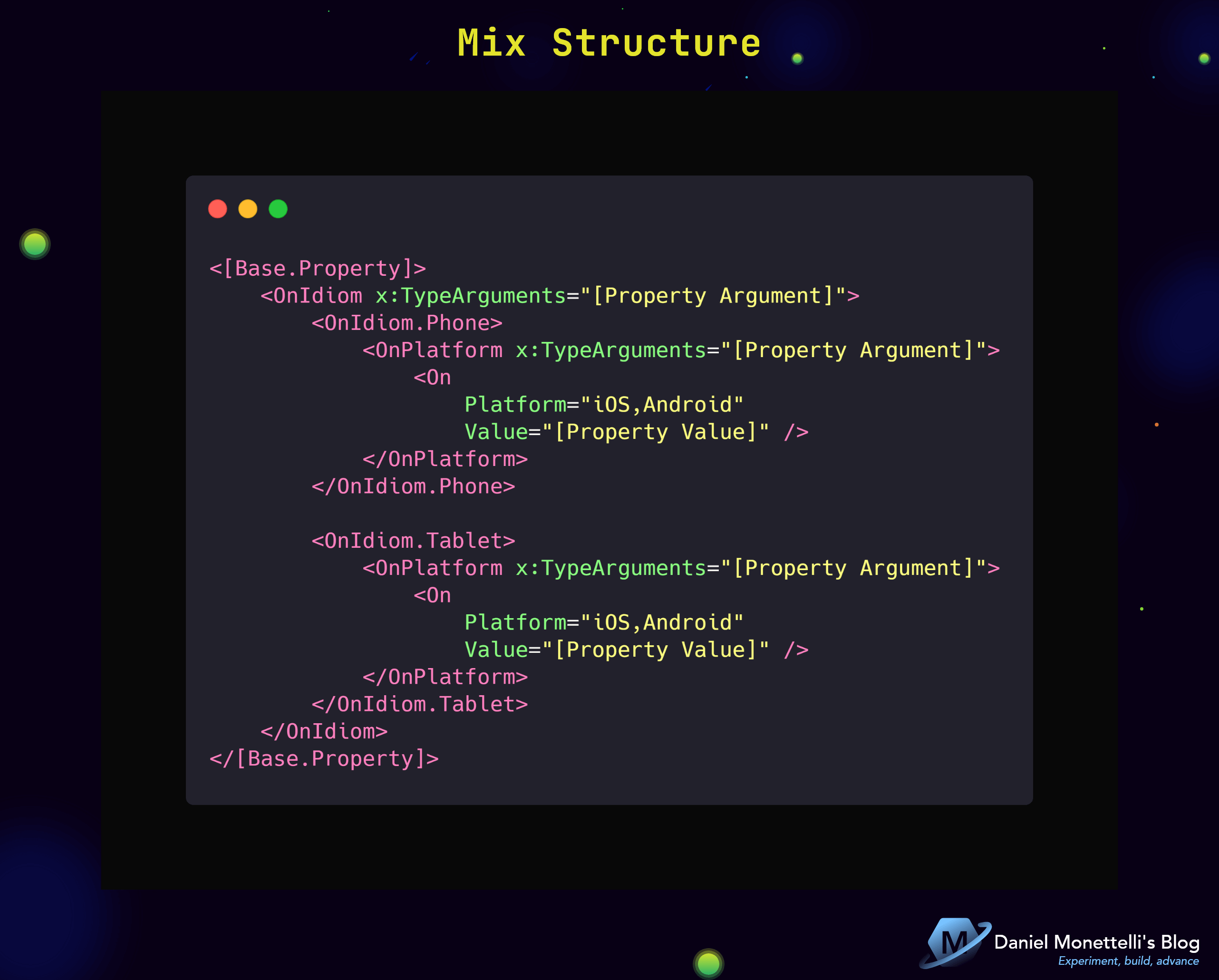
Mix Structure
This Structure is the holy grail of Harmonic Interfaces, we can manipulate specific aspects in Tablets, Phones, Desktops, TV’s, etc., and choose them on the different platforms that Xamarin.Forms supports(UWP, Android, iOS, macOS, Samsung Tizen, etc.).
The following will name the parts that are not explicitly described in the Mix Structure:
- Base.Property: The Base can be a Layout, Control, RowDefinition or ColumnDefinition, and the Property is the property from which the Mix will be added. Example:
1
2
3
4
5
6
7
8
9
10
11
<RowDefinition>
    <RowDefinition.Height>
    <!--  Use of the "Mix" here  -->
    </RowDefinition.Height>
</RowDefinition>

<Image>
    <Image.HeightRequest>
    <!--  Use of the "Mix" here  -->
    </Image.HeightRequest>
</Image>
- Property Argument: It is the argument that the assigned property takes, in the following example the property argument is of type Double.
- Property Value: It is the value of the property, according to the given argument.
1
2
3
4
5
6
7
8
9
10
11
12
13
14
15
16
17
18
19
20
21
22
23
24
<Image>
    <Image.HeightRequest>
        <OnIdiom x:TypeArguments="x:Double">
            <OnIdiom.Phone>
                <OnPlatform x:TypeArguments="x:Double">
                    <On
                        Platform="iOS,Android"
                        Value="120" />
                </OnPlatform>
            </OnIdiom.Phone>

            <OnIdiom.Tablet>
                <OnPlatform x:TypeArguments="x:Double">
                    <On
                        Platform="iOS"
                        Value="540" />
                    <On
                        Platform="Android"
                        Value="470.5" />
                </OnPlatform>
            </OnIdiom.Tablet>
        </OnIdiom>
    </Image.HeightRequest>
</Image>
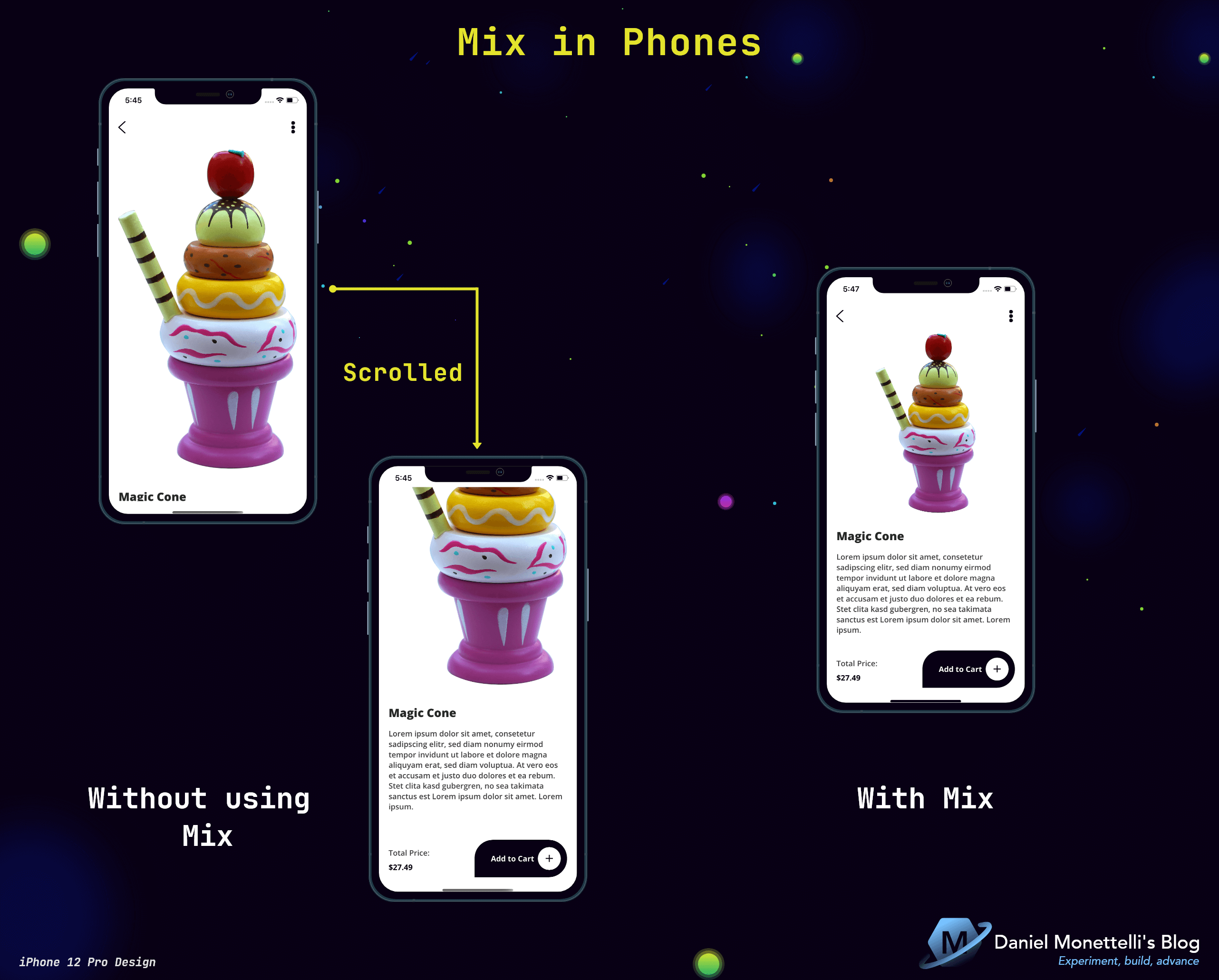
Mix in Phones
- Without using Mix on Phones: The image occupies almost the entire height of the device, is generated scrolled and a terrible global display of the user.
- With Mix on Phones: The image has a fixed height, optimal display for the user and therefore good UX.
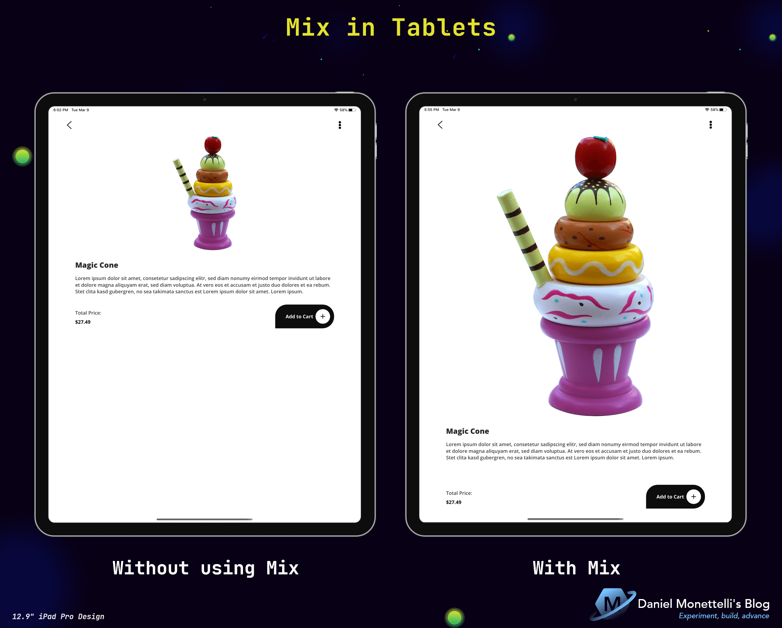
Mix in Tablets
- Without using Mix on Tablets: By having an image with a fixed altitude and a defined distance with the lower controls, it generates a large space, in this case, the visual point is centered on the image of the food, which is little appreciated.
- With Mix on Tablets: By generating proportions to the image and the distance with the lower controls, these adapt, eliminating said large space, the visual point of the image is good, and therefore there is a good UX.
The Result
Get the Code
All the code is open source, you can see it by clicking the following image:
Resources
- MonettelliUIKIT.
- Xamarin Community Toolkit.
- Material Design.
- OnIdiom (Adjusting UI Based on Device Type).
- OnPlatform (Adjusting UI Based on Operating System).
- Safe Area Layout Guide on iOS.
- Xamarin.Forms.PancakeView.
- Dribbble.
- Unsplash.
- Pexels.
Conclusions
- Xamarin Community Toolkit is our ally when it comes to creating productive applications, a kit supported by community members under the guidance of the Xamarin team, that makes it a super reliable nuget package.
- There are many ways to adapt our elements in an interface, Mix is one of them, because it encompasses devices and platforms that Xamarin.Forms supports.
- Another thing that was seen are the colored guides for the locations of elements, this method helps to place the different layouts and controls that exist in a XAML interface.
- The use of Material Design is essential as part of good UI/UX practices.
Remember that you can give feedback and with the help of my repository draw your own conclusions, if you have any questions or constructive criticism write to me below this publication, thank you very much.
